


By using our website, you agree to the use of cookies as described in our Cookie Policy
Blog
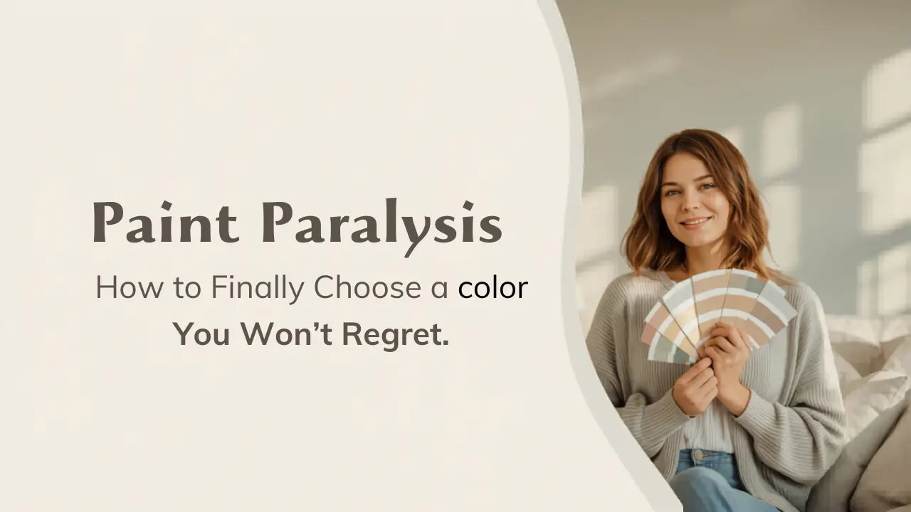
Paint Paralysis: How to Finally Choose a Color You Won't Regret
Toupin Construction · Walnut Creek, CA · 925-937-4200
You've been standing in the paint aisle for forty-five minutes. You're holding seven swatches. They all look like the same shade of greige, except one is "Drift of Mist" and one is "Sea Salt Morning" and somehow they're completely different colors at home. This is paint paralysis — and it's real, it's common, and it's completely fixable.
We've done painting and remodeling work across Walnut Creek, Rossmoor, and the rest of the East Bay for over 40 years. We've seen paint choices go sideways. We've also helped hundreds of homeowners land on colors they love. Here's everything we've learned — including a personal story that is equal parts embarrassing and instructive.
Key Takeaways
- Don't start with paint — start with what's already in the room.
- Decide how you want the space to feel before you choose a hue.
- Paint large samples (at least 2×2 feet) and test a lighter and darker version side by side.
- Live with your samples for at least 2–3 days — morning, afternoon, and evening light all tell a different story.
- Never pick a color by its name alone. Ask me about "Viking Diva" and I'll explain.
My First Paint Disaster
When I was fourteen, I finally got to pick my own bedroom color. I didn't need advice. My dad — Tim, who founded Toupin Construction — might have overseen hundreds of remodels, but I was clearly the expert here.
I saw it on the swatch: "Viking Diva." Vikings are awesome. I was definitely a diva. Done and done.
My dad suggested something lighter. Something a little more subtle. I said no. He painted my room. It was awful — a dark, moody cave I spent four years regretting. I never admitted it out loud, but I learned something that summer: the name on a paint chip means nothing. How it actually looks on your walls, with your light, next to your furniture — that's the whole game.
"The name on a paint chip means nothing. How it looks on your walls, in your light — that's the whole game."
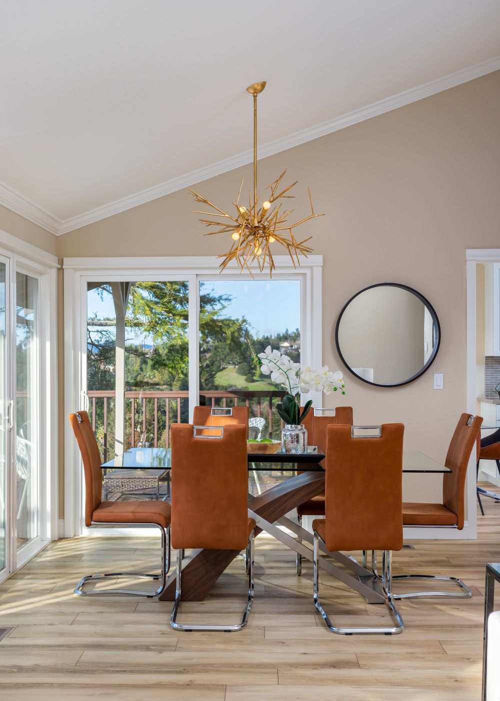
This bright, modern dining space showcases how warm neutral paint colors create an inviting and balanced atmosphere. Soft beige walls pair with natural wood flooring and caramel-toned leather chairs, while large windows flood the room with natural light. The combination of warm tones and clean lines makes the space feel both welcoming and refined—an ideal example of how subtle color choices can shape the overall mood of a room.
Why Paint Color Is Harder Than It Looks
Here's the sneaky truth: paint swatches at the store are small, lit by fluorescent lights, and surrounded by other colors that influence how you perceive them. The color you fall in love with at the hardware store has almost nothing to do with what ends up on your wall.
Undertones — Every paint color has a secondary hue hidden underneath the main color. A gray might have blue undertones that only reveal themselves at noon, or pink undertones that come out under warm evening light. It's why "Agreeable Gray" can look lavender in one home and beige in another. Testing in your actual space is the only way to see what an undertone will do.
Light changes everything. The East Bay has a distinct quality of light — warm and golden in the afternoon, cool and hazy in the morning. A color that looks crisp and clean in the store might feel cold and institutional in your Rossmoor living room at 7am. Testing matters. We'll get to exactly how.
How to Choose a Paint Color That Actually Works
1. Start With What's Already in the Room
Before you pull out a single swatch, look at what's staying. Your floors. Your cabinets. Your sofa. Your countertops. Whatever art is hanging on the wall. These are your anchors, and your paint color needs to work with them — not compete with them.
Pull the most dominant color from your fixed elements and build from there. If you've got warm oak floors and cream cabinets, you're working in a warm palette. Cool white marble countertops and gray tile? Cooler palette. Your paint color should feel like it belongs to the same family.
2. Decide How You Want the Space to Feel
Color sets tone before a single piece of furniture is in the room. Before you obsess over specific shades, answer this: what feeling do you want to walk into?
- Blues — Calm, collected, restful. Great for bedrooms and bathrooms.
- Greens — Grounded, organic, connected. Beautiful in kitchens and dining rooms.
- Yellows & warm creams — Energized and welcoming. Works hard in a kitchen.
- Grays & taupes — Timeless, flexible, easy to layer. The workhorse of neutral palettes.
- Deep, saturated tones — Dramatic and cozy. Incredible in a home office or powder room.
- Crisp whites — Clean, open, fresh. Harder to land than people expect — there are hundreds of whites.
Once you know the mood, you can narrow from hundreds of options down to a manageable handful. Feeling guides color. Color guides everything else.
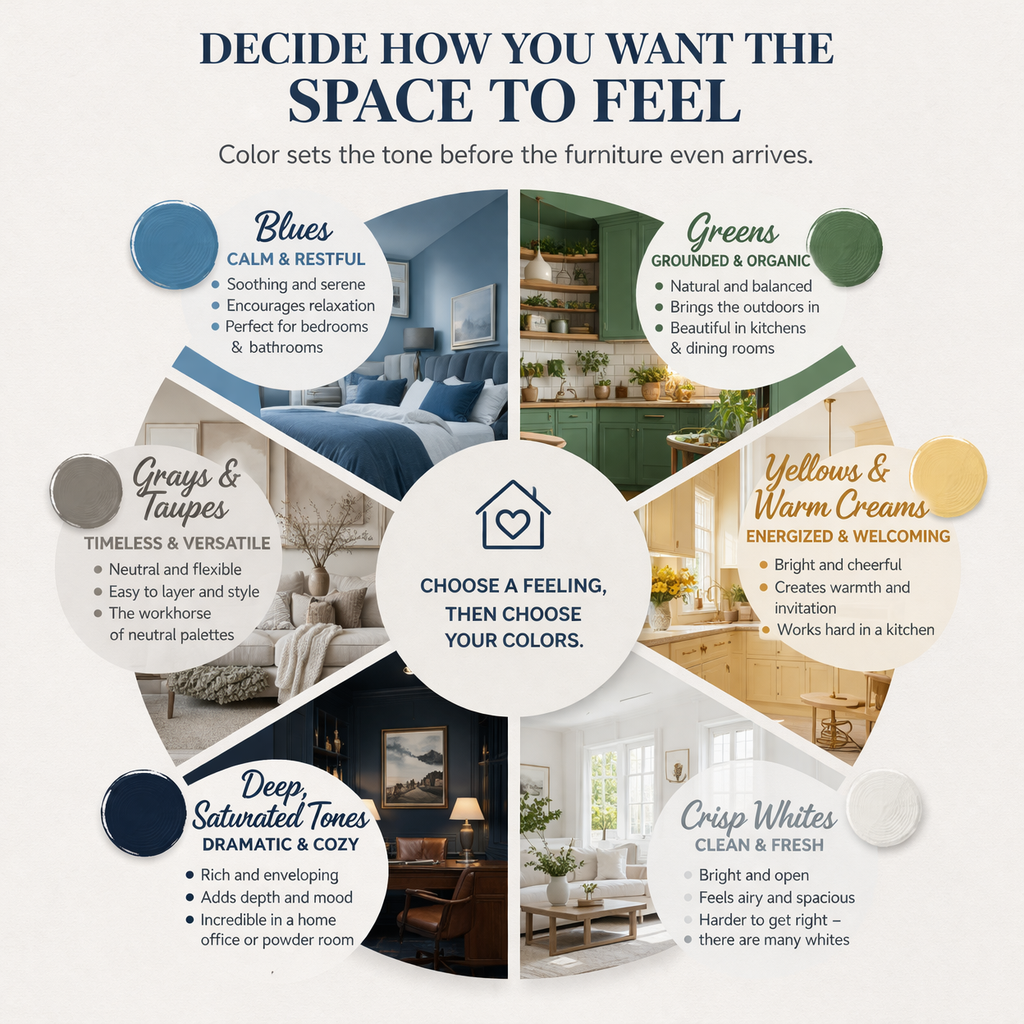
This visual guide helps homeowners choose paint colors based on the feeling they want to create in a space. Organized in a circular layout, it breaks down six core color families—blues, greens, warm yellows, grays, deep tones, and crisp whites—and connects each to a specific mood and ideal room use. From calm, restful blues in bedrooms to dramatic, cozy deep tones in offices, the chart reinforces a key design principle: start with the feeling, then choose the color.
3. Go Big With Samples — Much Bigger Than You Think
Those little 2×2 inch chips at the paint counter are practically useless. Paint a swatch at least 2 feet by 2 feet directly on your wall. Better yet, grab a large piece of poster board, paint it, and move it around the room.
Always test a shade lighter and a shade darker alongside your main pick. You might end up loving the lighter version — or you'll confirm that the original was right. Either way, you'll know.
4. Live With It for a Few Days
This is the step people skip. Don't.
Paint your large sample swatches and then check them at different times of day:
- Morning light — cool and crisp, reveals blue and gray undertones
- Midday light — your truest read of the actual color
- Afternoon light — warm and golden, brings out reds and yellows
- Evening with lamps on — artificial light shifts everything, especially whites
By day three, you'll feel it. You'll either keep walking past that swatch thinking yes, or you'll start feeling a low-grade sense of dread. Trust that instinct.
Your Step-by-Step Paint Color Process
- List every element in the room that's staying — floors, cabinets, furniture, hardware, art.
- Identify whether your fixed elements are warm-toned or cool-toned.
- Decide on the mood or feeling you want in the space.
- Pull 3–4 candidate colors that fit your mood and palette direction.
- Paint large (2×2 foot) samples on the wall for each candidate.
- Test a lighter and darker version alongside your top pick.
- Observe all samples across at least 3 days, in morning, afternoon, and evening light.
- Make the call. Commit. Buy your paint.
A Real-Life Example From Rossmoor
We worked with a client in Rossmoor — one of those beautiful 1960s homes with oak hardwood floors and original mid-century bones. She'd fallen in love with a cool gray-green against her dark hardware and white oak floors. Sophisticated, layered, a little moody. Exactly right on paper.
On site, we tested three versions. The first looked almost blue in morning light — lovely, but not what she wanted. The second read too beige under warm evening bulbs. The third — a slightly warmer mid-tone that bridged both light conditions — was the winner. Same color family. Very different results. This is why we test.
Common Mistakes (and How to Avoid Them)
Picking by name. "Hale Navy," "Accessible Beige," "Agreeable Gray" — the names are marketing. The color is chemistry. Test it, don't just like the name.
Choosing paint before everything else. Paint is the last decision, not the first. Lock in your floors, cabinets, countertops, and fixtures first. Then find a paint color that brings it all together.
Testing swatches against white paper. If you're holding your chip against a white piece of paper to judge it, you're judging it wrong. Hold it against your actual floors. Your actual cabinets. Your actual sofa.
Skipping the lighting test. We've said it before and we'll say it again: the East Bay has warm afternoon light that will change your color. The morning fog light is different. Your LED recessed lighting is different. Check all of them before you commit.
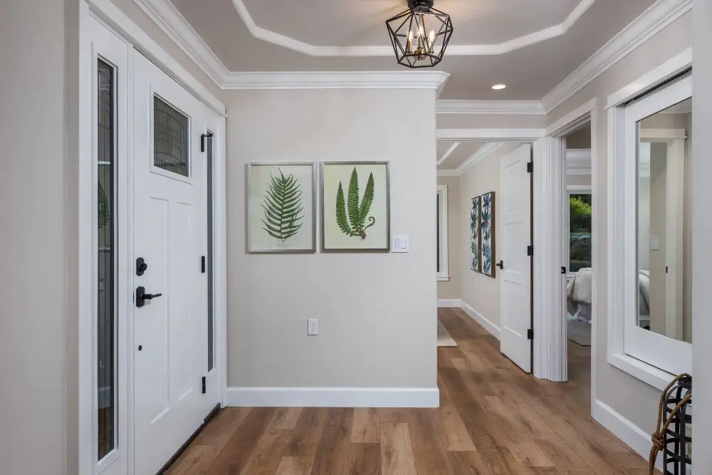
This entryway highlights the power of soft neutral paint colors in creating a calm, cohesive first impression. The light greige walls (a blend of gray and beige) provide a versatile backdrop that complements the warm wood flooring and crisp white trim. Clean lines, natural textures, and subtle greenery artwork add to the grounded, welcoming feel. This type of neutral palette is a workhorse in home design—easy to layer, timeless, and adaptable to both modern and traditional spaces.
Questions We Hear All the Time
What should I do before picking a paint color?
Inventory what's staying in the room — flooring, furniture, cabinets, countertops, hardware — and identify whether those elements read as warm or cool. Your paint should work with them, not fight them.
How big should my paint samples be?
At least 2×2 feet on the actual wall, not a tiny chip. And always test a shade lighter and darker alongside your main pick. The chip you love in the store is rarely the right call at full scale.
How long should I live with a paint sample before deciding?
At least 2–3 days. Check it in morning light, afternoon sun, and evening with your lamps on. If you're still loving it by day three, you've got your color.
What's the biggest mistake people make when choosing paint?
Choosing the paint color first, before everything else is locked in. Paint is the last decision in a remodel — it's meant to tie everything together, not lead the way.
Does it matter what kind of paint finish I choose?
Yes — and this one surprises people. Flat paint hides imperfections beautifully but scuffs easily. Eggshell and satin are the workhorses for most living spaces. Semigloss and gloss are for trim, doors, and high-humidity areas like bathrooms. Ask us and we'll point you in the right direction for your specific space.
Still Not Sure Where to Start?
We're happy to walk through your space with you and give you an honest read on color direction — no pressure, no pitch. Just a conversation with people who've been doing this for 40 years.
Get a Free Quote See Our Portfolio
Toupin Construction
Ready to start your remodel?
Whether you're dreaming of a new kitchen, a spa-worthy bathroom, or a whole-home transformation — we’d love to hear about your project. Reach out and let's talk.
‹ Back
Comments