


By using our website, you agree to the use of cookies as described in our Cookie Policy
Blog
Paint Undertones: Why Your Color Looks Wrong Next to the Trim
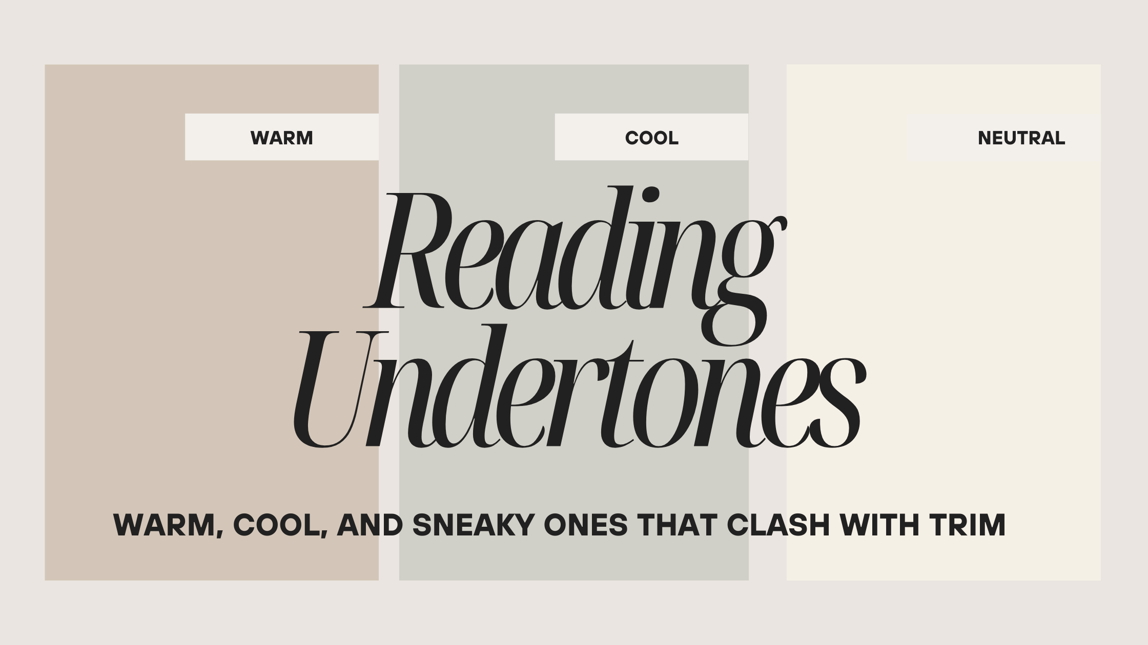
Paint Undertones: Why Your Color Looks Wrong Next to the Trim
A homeowner in Lafayette texted me a photo last fall. She'd painted her living room a color called "Perfect Greige" — and next to her white trim, it had turned lavender. Not a little lavender. Noticeably lavender. She thought she got a bad batch. She did not get a bad batch. The paint was exactly what it said it was. It just had a violet undertone that nobody warned her about, and the bright white trim pulled it right out into the open.
This happens on almost every project where the homeowner picked a color alone at the store. And it's not their fault — paint chips under store lighting are practically useless for predicting what a color will do in your actual home, next to your actual trim. Undertones are sneaky. They hide until the moment they don't.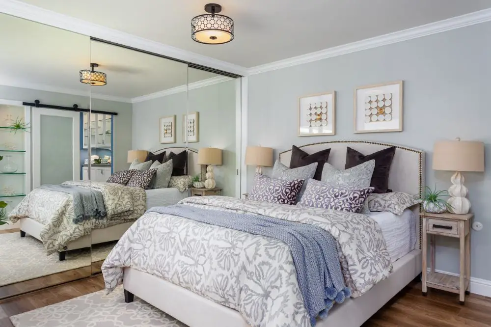
A serene bedroom featuring soft, cool-toned neutrals on the walls, leaning toward a subtle blue-gray undertone. The paint color shifts gently in different lighting, appearing slightly warmer near the mirrored closet and cooler along the main wall. Layered textiles in muted grays, creams, and soft blues enhance the calming palette, while warm wood flooring and beige accents keep the space balanced. This is a great example of how cool neutrals can still feel inviting when paired with warm elements.
Here's what they are, how to spot them before you're stuck, and — most importantly — how to avoid the clash that has homeowners calling us for a repaint they didn't budget for.
Know the Lingo
What Is an Undertone?
Every paint color has a dominant hue — what you'd call it at a glance. But it also has an undertone: a secondary color hiding underneath that only becomes visible when the paint is next to other colors, in real light, on a real wall. A "warm gray" might have a brown undertone. A "soft white" might have a green one. A "greige" might read pink. You won't see any of this on a 2-inch chip under fluorescent store lights. You will absolutely see it once it's on your walls next to your trim.
Warm, Cool, and Neutral: The Three Families
Every color lives in one of three families. Understanding which family your wall color and your trim belong to is the foundation of getting them to actually look right together.
Warm Undertones
Carry red, yellow, or orange beneath the surface.
- Creamy whites
- Beige with yellow pull
- Terracotta
- Camel, honey
- Warm grays (greige)
Feel cozy, inviting, lived-in. Great for north-facing rooms that need warmth.
Cool Undertones
Carry blue, green, or violet beneath the surface.
- Blue-gray
- Green-gray
- Soft lavender
- Icy whites
- Cool charcoal
Feel crisp, airy, modern. Balance sunny south-facing rooms that already run hot.
Neutrals (Still Lean)
Greige, taupe, off-white — these always tilt one direction.
- Greige → warm or cool
- Taupe → can hide pink
- Off-white → creamy or icy
The most dangerous category — we assume they're "safe" until they aren't.
The trap with neutrals is that we treat them like a get-out-of-jail-free card. "It's just greige, it goes with everything." That's not true. Greige can go strongly warm or strongly cool depending on the undertone, and if your trim is pulling the other direction, you'll feel that clash every day — you just might not be able to name why.
Toupin TipThe fastest way to identify an undertone: line up three similar-looking paint chips on plain white printer paper. One will look more yellow, one more blue, one more pink. That's the undertone talking. Name it out loud — "this one's going green." Naming it helps your brain lock it in so you don't talk yourself out of what you're seeing when you're standing in the paint aisle second-guessing everything.
How Light Changes Everything
Here's the part nobody tells you at the paint counter: your color doesn't stay the same throughout the day. The direction your room faces and the bulbs you use both pull different undertones forward at different times.
In East Bay homes — especially in Walnut Creek and Rossmoor — this matters more than people expect. Rossmoor's courtyard-facing units get a particular kind of diffused afternoon light that can make cool grays look almost green. South-facing rooms in Lafayette bake in warm afternoon sun that makes creamy neutrals look almost orange by 4pm. This isn't the paint behaving badly. It's physics.
| Light Direction | What It Does to Color | What to Watch For |
|---|---|---|
| North-facing | Cooler, blue-leaning light all day | Cools can feel chilly; warms feel balanced |
| South-facing | Warm, bright light, especially afternoon | Warms can look intense; cools feel balanced |
| East-facing | Warm morning light, cooler afternoons | Color shifts noticeably throughout the day |
| West-facing | Cool mornings, golden-warm evenings | Test at evening — that's often when it matters most |
And then there's your bulb temperature — the Kelvin rating on the box — which does its own thing to your paint.
| Bulb Temperature | Label on Box | Effect on Paint Color |
|---|---|---|
| 2700K–3000K | Warm White | Cozy; can push creamy whites toward yellow |
| 3500K | Neutral White | Most balanced; best for judging true color |
| 4000K+ | Cool / Daylight | Crisp; can pull blue or green undertones forward |
Toupin TipTest your color samples morning, midday, and evening. It sounds like overkill until you paint a room that looks perfect at noon and slightly wrong every night when you're actually in it with the lights on. If the room is used most in the evening — a dining room, a bedroom — test it under your actual evening lighting conditions before you commit to gallons.
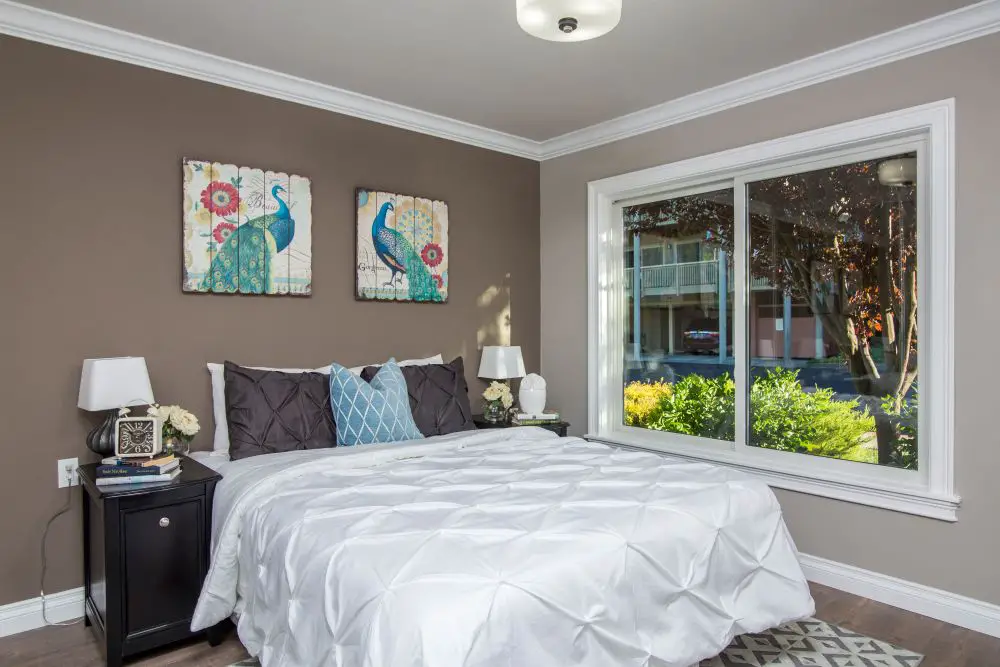
A cozy bedroom showcasing a warm taupe wall color with noticeable brown and slightly red undertones. The paint reads consistently warm throughout the space, especially in natural daylight from the large window. Crisp white bedding and trim provide contrast, while dark furniture and soft blue accents highlight how warmer neutrals can still work beautifully with cooler decor elements. This room demonstrates how undertones become more obvious when compared with surrounding finishes.
The Sneaky Clashes: When Walls Fight the Trim
The most common source of "something looks off but I can't figure out what" is a wall color and trim color sitting in opposite undertone families. The individual colors might be beautiful on their own. Together, they pull against each other in a way that's hard to name but impossible to ignore once you see it.
Here are the clashes I see most often in East Bay homes — and the fix for each.
⚠ The Problem
Warm beige walls + icy cool-white trim. The trim reads almost blue-white. The walls look almost orange by comparison. They don't belong to the same room.
✓ The Fix
Switch to a trim white with a slightly warm or neutral base — Benjamin Moore White Dove or Chantilly Lace work well. Or cool the wall down one step.
⚠ The Problem
Cool blue-gray walls + creamy warm-white trim. The trim reads yellow or dingy. The walls make it worse. Clients describe this as the walls looking "dirty."
✓ The Fix
Pair cool walls with a bright, cool-white trim — think Sherwin-Williams Extra White or Pure White. Keep the undertone families matched.
⚠ The Problem
"Neutral" greige walls that go pink or lavender next to white trim. This is the Lafayette greige situation. The trim pulls the hidden violet undertone out and amplifies it.
✓ The Fix
Sample the greige on a large board right next to your actual trim paint before you commit. If it's going pink, it'll go pinker on the wall. Step toward a warmer or more brown-based greige.
⚠ The Problem
Green-gray walls + warm wood floors. The orange in the oak pulls the green undertone of the wall color forward. Both are fine independently. Together they go muddy.
✓ The Fix
Test the wall color directly on a sample board next to the floor, not just next to the trim. Fixed finishes like floors drive your paint decisions more than most people realize.
Know the Lingo
LRV — Light Reflectance Value
LRV is a number from 0 to 100 that tells you how much light a paint color reflects. Pure black is 0. Pure white is 100. Most wall colors fall between 30 and 80. A higher LRV makes a room feel brighter and more open. A lower LRV creates depth and moodiness. This matters for undertones because higher-sheen finishes (satin, semi-gloss) reflect more of the room around them — including your floors, trim, and furniture — which can make undertones louder than they'd appear in a flat finish. Your trim is usually in a semi-gloss. That's why it announces its undertone so clearly.
The Floors, Tile, and Countertops You Can't Change
Here's the part of this conversation that paint stores skip entirely: your fixed finishes are running the show, whether you involve them in the decision or not.
Oak floors with a warm, orange-toned stain will push yellow and orange into every color in the room. A white quartz countertop with cool gray veining will push blue into your kitchen walls. Rossmoor units from the '60s often have original tile that has a very specific warm beige tone — and if you fight it with a cool gray wall, the tile looks dingy and the walls look cold.
We always ask clients to bring us a photo of their floors and tile before we weigh in on paint. Not because we're being thorough for the sake of it — because the floor will make the final call regardless, and it saves everyone time and money to know that upfront. We do the same thing during our interior painting projects — every color recommendation happens in the context of what's already fixed in the space.
Toupin TipWhen you make your large sample boards (more on that below), prop them directly against your floors and tile — not just your trim. Hold them at floor level. You'll immediately see relationships you couldn't see on a chip.
How to Actually Sample a Color Before You Commit
The chip-on-the-wall trick doesn't work. I know everyone does it. It doesn't work. A 2-inch chip has no context. Your eye needs area, neighbors, and real light to read a color accurately. Here's the process that actually does work:
- Gather 3–5 close shades in the same family— at least one warmer, one cooler. You need comparison to read undertones. A single chip tells you almost nothing.
- Put them on plain white printer paper and name the undertone out loud."This one's going yellow." "That one's pink." Say it. Write it on the chip.
- Paint large sample boards — poster board or foam core.Two full coats. Leave a crisp white border around the edge as a neutral baseline for your eye.
- Move the boards around the room.Hold them next to the trim. Set them against the floor. Prop them by the tile. The color will look different in every location — that's not a bug, that's exactly the information you need.
- Check morning, midday, and eveningunder your actual bulbs. Note what time of day the room gets used most and prioritize that reading.
- Confirm your wall and trim are in the same undertone family— or choose a truly neutral white trim that doesn't fight either direction.
If you're in decision paralysis somewhere in the middle of this process, we've written about that too: how to break through paint paralysis without redoing the whole decision from scratch.
Pairings That Actually Work
If you want a starting point that's lower risk, these combinations play well in East Bay homes — we've seen them work across Walnut Creek, Danville, Alamo, and Rossmoor.
Warm with Warm
- Soft beige or warm greige walls + creamy off-white trim (shared yellow base — nothing fights)
- Muted clay or terracotta walls + warm off-white trim (earthy, grounded, very East Bay)
- Sage-green with yellow lean + warm off-white trim (gentle, works beautifully with oak floors)
Cool with Cool
- Pale blue-gray walls + bright, cool-white trim (airy, modern, great for south-facing rooms)
- Misty green walls + neutral-to-cool white trim (spa calm without going mint)
- Soft blue walls + cool white trim (reliable for bedrooms and bathrooms)
When You're Not Sure: Go Neutral on the Trim
- A truly neutral white trim — not warm, not cool — gives you the most flexibility on wall color
- Benjamin Moore White Dove (slightly warm but very balanced), Sherwin-Williams Alabaster (soft neutral warm), and Benjamin Moore Chantilly Lace (true bright neutral) are our most-used trim whites
- If you're dealing with a lot of cool fixed finishes (stone, gray tile, cool quartz), lean toward a neutral or cool white trim — creamy trim next to cool stone will read yellow fast
"The trim doesn't clash with the wall. The trim reveals what was already in the wall — the undertone that was hiding the whole time."
When to Call In Backup
Some paint decisions are straightforward. Some aren't. If you're working around a fixed finish that's particularly tricky — unusual tile, strong wood staining, an open floor plan where three rooms need to talk to each other — it's worth getting a professional eye on it before you buy gallons.
We do this as part of our painting work. Before we pick up a brush, we look at the whole room — what's fixed, what's changing, what the light is doing — and make sure the color you've chosen is going to do what you think it's going to do. For more on what that looks like, you can see our interior painting services or check out the process we follow on every project.
And if you're in the middle of a bigger remodel — kitchen, bathroom, whole house — paint color decisions belong in the same conversation as cabinet color, tile selection, and countertop finish. We've seen beautiful tile choices undermined by paint that fights them, and vice versa. If you're doing a kitchen remodel or bathroom remodel, bring the paint question into the room early.
Still Not Sure Which White Is Your White?
We've been making paint decisions in East Bay homes for over 40 years. Sometimes you just need someone to stand in the room with you and say "that one." We're happy to be that person — no obligation, just an honest conversation.
Talk to Us About Your ProjectOr call: 925-937-4200 · CA Lic #626819
Toupin Construction
Ready to start your remodel?
Whether you're dreaming of a new kitchen, a spa-worthy bathroom, or a whole-home transformation — we’d love to hear about your project. Reach out and let's talk.
‹ Back
Comments