


By using our website, you agree to the use of cookies as described in our Cookie Policy
Blog
The Color Game Plan: How to Build a Whole-Home Palette That Actually Works
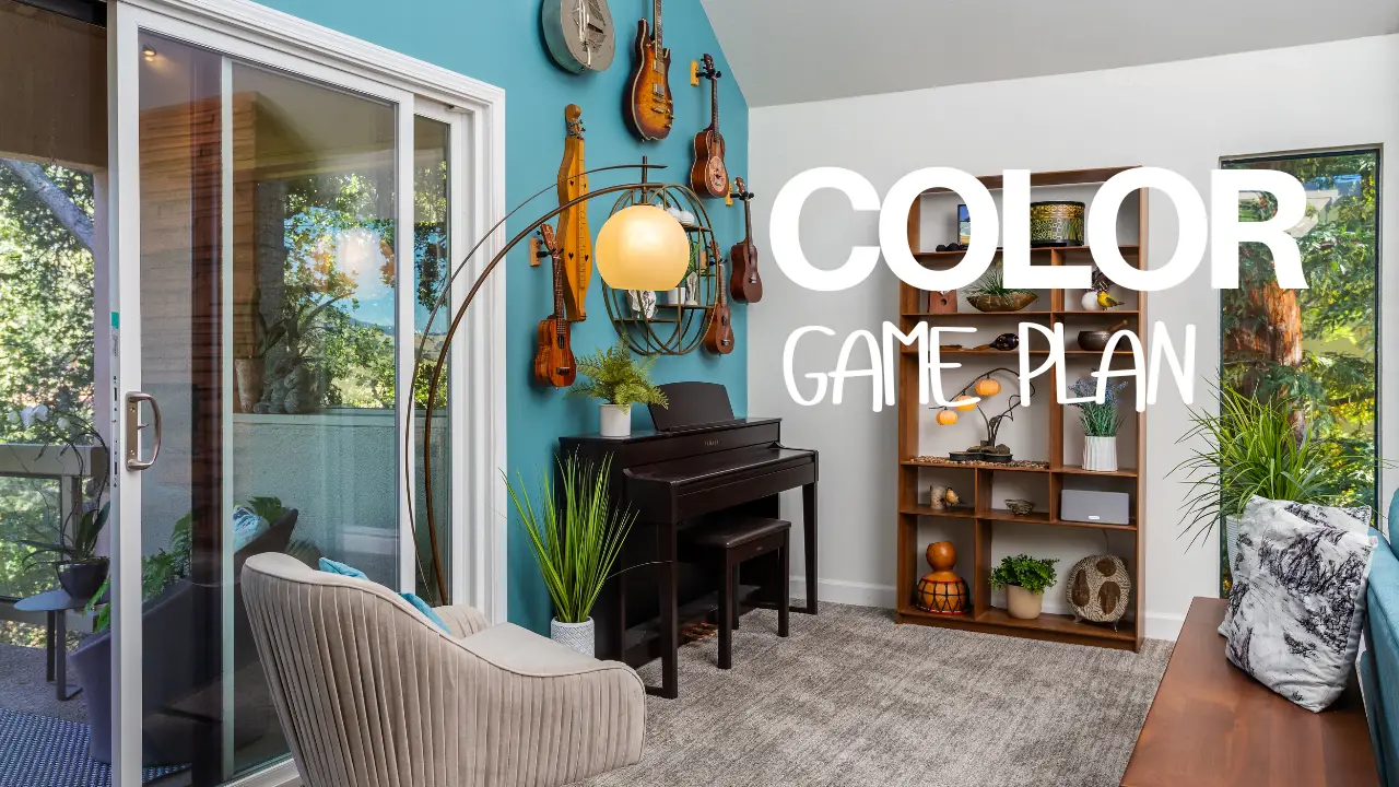
The Color Game Plan: How to Build a Whole-Home Palette That Actually Works
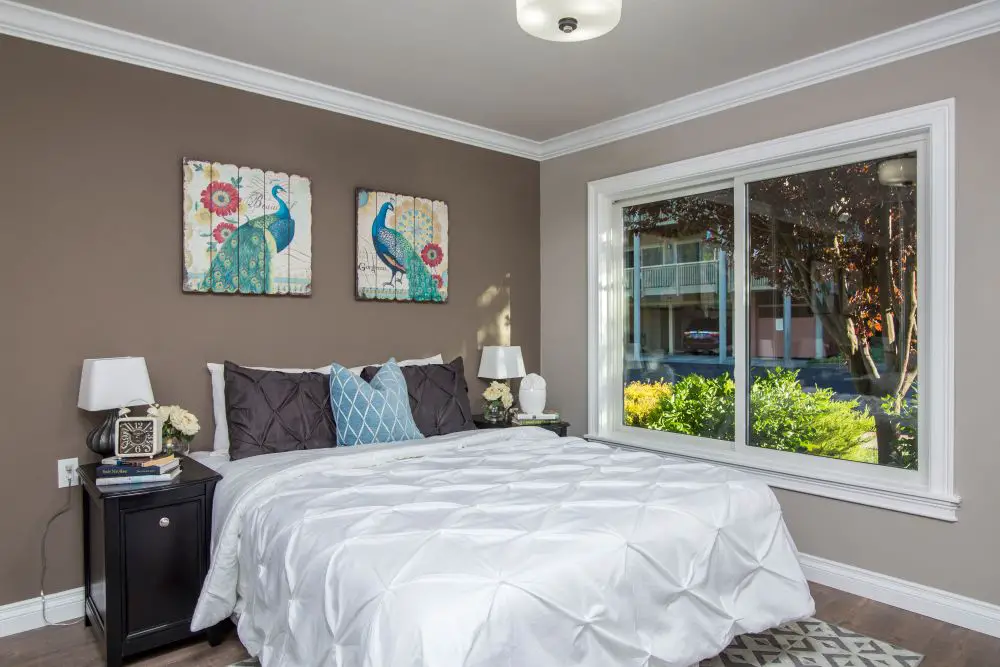
A cozy bedroom featuring warm taupe walls with rich brown undertones that become more pronounced in natural daylight. The color reads consistently warm throughout the space, especially when paired with crisp white bedding and trim. Dark furniture adds contrast, while subtle blue accents highlight how warm neutrals can still work alongside cooler decor. This is a great example of how undertones reveal themselves through comparison with surrounding finishes.
We were on a job in Danville a couple of years ago — a whole-house remodel, beautiful home, smart clients. They'd spent three weekends choosing their main color. Seriously debated it. Landed on a warm gray greige they both loved. Paint went up. Kitchen looked great. Then they stood in the hallway doorway and looked into the living room and immediately said: "Why does it look different in there?"
Same color. Same batch. Different result — because the living room faced north, the hallway faced south, and nobody had mapped how the light was going to behave across the two spaces before a single gallon was purchased. They didn't need better taste. They needed a better process.
That's what this post is. Not a mood board. Not a list of trending colors for 2026. A process — the actual sequence we walk through with clients before anyone picks up a brush. Follow it and you won't end up repainting in six months.
Step 1
Start With What's Already There
Every home already has anchors — the things you're not changing that quietly control every color decision you make. Floors. Countertops. Tile. Stone. Large furniture that's staying. These are not neutral. They all carry undertones, and those undertones will interact with whatever you put on the walls whether you account for them or not.
Pull samples of anything permanent before you even look at paint chips. Hold them next to each other. Warm oak floors lean yellow-orange. Carrara marble runs blue-gray. A beige quartz countertop might read pink or green depending on the veining. These aren't the colors you're choosing — they're the colors that are choosing for you, whether you show up to the conversation or not.
Toupin TipTake photos of your fixed finishes morning, midday, and early evening. Natural light shifts color dramatically across the day, and in East Bay homes — where you can get coastal fog in the morning and bright afternoon sun by 2pm — that shift is significant. Your phone camera is honest in a way that your eye, which adapts automatically, is not.
This step also tells you whether your home naturally wants to be warm or cool — and that becomes the foundation of everything else. Fighting your fixed finishes is expensive and usually unsuccessful. Working with them takes you half the distance before you've even opened a paint deck.
For a deeper look at how undertones work between fixed finishes and paint, read our post on reading paint undertones and why colors clash with trim.
Step 2
Pick One Color You Actually Love — Then Build From It
Not one color per room. One color that anchors the whole home. This is the color you feel something about — the warm off-white that makes the living room feel like a Sunday morning, the muted blue-green that finally makes the kitchen island feel intentional, the sage that's been living on your saved Instagram posts for two years. That one.
Everything else in your palette is going to be a relationship with this choice. Lighter versions of it, darker cousins, complementary tones that share its undertone family. When clients bring me a stack of 30 paint chips and tell me they like them all equally, I know we need to go back to this step. You can't build a palette from indifference. Pick the one that has a little pull on you and start there.
Know the Lingo
The 60-30-10 Rule
This is a soft framework for whole-home color balance that designers have used forever. 60% is your dominant color — the main walls, the largest surfaces. 30% is your secondary — often an adjacent room, a bedroom, an accent wall. 10% is your accent — a door, built-ins, a piece of furniture, the island. It's not a law. But when a palette feels "off" and we can't figure out why, often the proportions are wrong: too much accent color bleeding into the main, or a secondary that's too similar to the primary to do any work. The ratio gives you a useful place to start troubleshooting.
One note here: an anchor color doesn't have to be bold. Some of the most beautiful whole-home palettes I've seen are built around a single well-chosen off-white with warm undertones — subtle enough to be almost invisible, specific enough to make every room feel connected. The anchor can be quiet. It just has to be intentional.
Step 3
Map the Flow Before You Paint Anything
Calm, cohesive homes share color DNA. The goal isn't matching — it's related. From any doorway, you should be able to see into the next room and feel like you're still in the same house. When that breaks down, the home starts to feel chopped up and restless, even if each individual room is beautiful on its own.
Walk through your home and write down how each space connects. Entry → living room → kitchen → hallway → bedrooms. Every transition point is a decision. Will the colors shift? By how much? Which direction — warmer, cooler, lighter, darker? Stand in the center of your main living area and look in all four directions. That's your most important test frame.
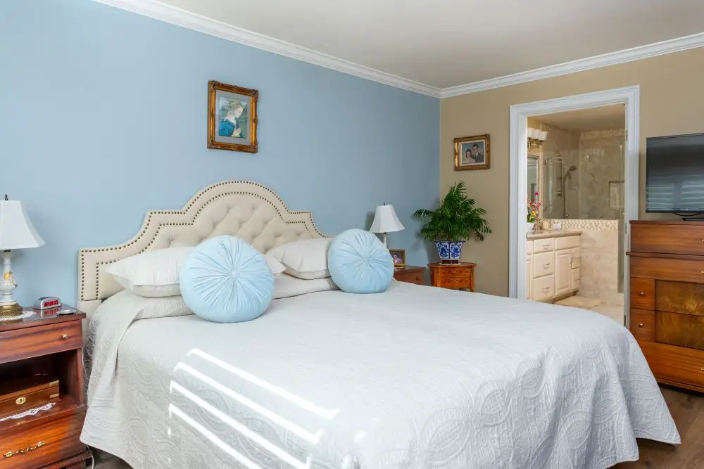
A bedroom demonstrating side-by-side undertones with a cool blue accent wall and a warm beige adjacent wall. The contrast makes the undertones immediately visible—the blue reads crisp and cool, while the beige leans soft and warm. White bedding and light furnishings help reflect both tones, making this a clear example of why comparing colors is essential to understanding undertones.
Here's a simple room-by-room framework that works for most East Bay homes:
| Space | Color Direction | Why |
|---|---|---|
| Entry & hallways | Your anchor neutral | Sets the tone for the whole home — transition space |
| Main living area | Anchor color, primary expression | Largest visual surface; the palette lives here |
| Kitchen | Repeat the base; accent on island or backsplash | Fixed finishes (tile, countertop) drive this room |
| Bedrooms | One or two steps warmer or cooler than main | Related but distinct — gives each room personality |
| Bathrooms | Coordinate with tile or stone first | Small rooms where fixed finishes dominate |
| Built-ins, doors, island | Your 10% accent color | Small-dose personality — use it sparingly |
In Rossmoor condos specifically, the open-plan layouts that are common in the larger units mean the living room, dining area, and kitchen are all visible from a single vantage point. You don't get the luxury of treating them as separate rooms. The color story has to work as one continuous space — which means your anchor color and your secondary need to be close enough to feel unified, with the variation happening in accent doses only.
Step 4
Get Honest About Light — In Your Actual Home
This is where most DIY color projects go sideways. Paint chips at the store are selected under fluorescent lights designed to make everything look appealing. Your home has a completely different light situation — and it changes throughout the day in ways that will affect how your color reads more than the color itself does.
The Danville couple at the start of this post had done everything right on paper. They just hadn't done the one thing that actually matters: tested the color in their specific rooms, at different times of day, over a few days. Once you've done that with a real sample board, you know. Until then, you're guessing.
Know the Lingo
LRV — Light Reflectance Value
Every paint color has an LRV score from 0 (absorbs all light — pure black) to 100 (reflects all light — pure white). Most wall colors fall between 30 and 80. It's the single most useful number when you're choosing paint for a specific room's lighting conditions. A room that faces north and gets indirect light all day needs a higher LRV — something that bounces light back into the space. A room that faces south and gets blasted with afternoon sun can handle a lower LRV without feeling like a cave. When a color feels too dark in your space or too washed out, the LRV is almost always why. You can find the LRV on most manufacturer spec sheets.
| Space / Condition | Ideal LRV Range | The Logic |
|---|---|---|
| Small or low-light room | 70–85 | Reflects light back; makes the space feel larger |
| Main living areas | 55–70 | Balanced warmth and brightness |
| Accent walls or feature color | 10–35 | Adds depth without closing in the whole room |
| Ceilings | 80–92 | Keeps rooms open and airy overhead |
Toupin TipPaint 12x16-inch sample boards — foam core or poster board, two full coats — and move them around the room instead of painting directly on the wall. Leave a crisp white border around each sample. That border gives your eye a neutral baseline so you're reading the color accurately, not comparing it to whatever's currently on the wall. Tape them near trim, set them against the floor, hold them next to the tile. Then check them morning, midday, and evening. If the color still works at all three — you've got your color.
If somewhere in this process you've opened 47 paint chips and they all look the same, we've written about exactly that feeling: how to get through paint paralysis without starting over from scratch.
Step 5
Balance Warm and Cool — Don't Let One Take Over
The most interesting palettes live between the two temperature families, not entirely in one. All-warm can feel heavy and dated — like the palette hasn't been updated since the early 2000s when terracotta and adobe ruled. All-cool can feel sterile and impersonal, the paint equivalent of a hotel lobby that nobody actually lives in.
The tension between warm and cool is what gives a home life. Warm oak floors grounding a smoky blue-gray wall. Creamy white trim pulling warmth into a cool sage room. Brass hardware in a room full of cool greens. That contrast creates depth in a way that a monochromatic palette — no matter how perfectly chosen — usually can't.
A useful check: stand in your main living area and look at all the finishes at once. Count the warm elements and the cool elements. If one side is running 4-to-1 against the other, that's probably where the heaviness or coldness you're feeling is coming from. You don't need to neutralize everything — you just need the other temperature family represented somewhere in the room.
Toupin TipMetals are one of the fastest ways to balance temperature. Brass and unlacquered bronze read warm. Polished nickel and chrome read cool. Matte black is surprisingly neutral — it sits in a room without pulling either direction. If your walls are running cool and the space feels cold, swapping out hardware to a warmer metal finish can shift the whole feel of the room without touching the paint.
Step 6
Match Sheen to How the Room Actually Gets Used
Sheen is the difference between a color that holds up and one that's looking dingy in eighteen months. It's not just a visual choice — it's a practical one. Higher sheen reflects more light and more of the surrounding room, which means it amplifies undertones and shows imperfections in the wall more clearly. Lower sheen absorbs more and hides flaws, but it also scuffs and marks more easily.
Here's how we typically call it on projects:
Flat / Matte
Ceilings and low-traffic walls. Hides imperfections beautifully. Cannot be scrubbed — mark it and you're repainting.
Eggshell
Our go-to for living rooms and bedrooms. Subtle sheen, wipeable, forgiving. The workhorse finish.
Satin
Kitchens, bathrooms, hallways. Handles moisture and cleaning well. Slight glow that reads nicely under task lighting.
Semi-Gloss
Doors, trim, baseboards, cabinets. Durable, washable, and crisp. Makes cut-in lines show up clearly — this is where craftsmanship matters.
One thing we always check: trim is almost always in semi-gloss or gloss, which means it reflects more light than the walls. That reflectivity is part of why trim announces its undertone so loudly — sheen amplifies it. If your trim is clashing with your wall color, sheen is part of that conversation. For a full breakdown, read our post on sheen by room.
Step 7
Lock Five to Seven Colors, Then Stop
A whole-home palette should have five to seven colors total. Walls, ceilings, trim, accent, and any special-purpose colors like a laundry room or powder bath. That's it. When you start creeping toward ten or twelve, the home starts to feel like a sampler — every room its own statement, none of them connected.
Think of your palette as a family: everyone related, no outliers. Trim color should be consistent throughout. Ceiling color should be consistent throughout (one or two steps lighter than your main wall color, or a true white — not the same color as the wall). The variations happen in wall color from room to room, and in accent placement.
Once you've locked the palette, document it properly. Not just the color name — the exact brand, formula number, sheen, and which room it goes in. Color names get retired or reformulated. "The warm gray in the hallway" is not useful information two years from now when you need a touch-up. Write down the formula and keep it somewhere you'll actually find it.
Toupin TipWe put together a simple paint schedule on every project — a one-page document listing each space, the paint brand and formula, the sheen, and any notes about prep or special conditions. Clients get a copy. It sounds like overkill until you're touching up a scuff three years later and you can't remember what the hallway color was. Ask your painter to do this, or make your own before the project ends.
Real Project · Walnut Creek
How We Built a Whole-Home Palette Around Warm Oak Floors
A family in Walnut Creek came to us during a kitchen-and-living room remodel. Their oak floors had a warm, golden-brown stain that they loved and weren't touching. Their countertops were a warm white quartz with very faint beige veining. Their existing trim was a creamy semi-gloss — slightly warm, not stark.
Everything was pulling warm. We started there.
The anchor color we landed on was a soft, warm off-white for the main living area and entry — high LRV, eggshell finish, enough warmth to work with the floors without competing with them. The kitchen stayed the same color on the upper walls but got a muted blue-green on the island, which gave the space a focal point without fighting the countertop or the backsplash. The den got a deeper mushroom tone — same undertone family as the main color, just several steps darker.
We tested everything at night, which is where it tripped us up: the pantry door color we'd originally chosen for the kitchen looked almost teal under the under-cabinet lights at 8pm. We pulled it one shade warmer and it landed right. That test saved them a repaint.
Five colors. One consistent trim. One ceiling. Clean, connected, and calibrated to the floors they started with.
"You can't build a palette from indifference. Pick the one color that has a little pull on you — and build everything else around that."
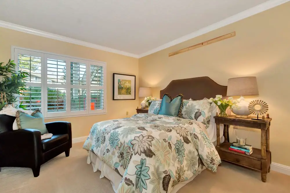
A welcoming bedroom with soft creamy yellow walls that lean warm with subtle golden undertones. The paint glows in natural light, creating an inviting atmosphere. Paired with wood furniture, floral bedding, and soft blue-green accents, the space shows how warm wall colors can feel balanced when layered with cooler textiles. This is a strong example of a warm color family that still feels light and livable.
The Whole-Home Color Checklist
Take this with you. Go through it in order. It works.
Your Color Game Plan — In Sequence
- Inventory your fixed finishes. Floors, countertops, tile, stone. Pull samples. Identify undertones. This comes before any paint decision.
- Photograph in three light conditions. Morning, midday, evening. Note how natural light changes the space.
- Pick one anchor color — a single color you feel something about. Warm or cool. Bold or neutral. The rest of the palette builds from here.
- Map the flow room by room. Write down how each space connects and how the color should shift — warmer, cooler, lighter, deeper.
- Apply the 60-30-10 check. Main color: 60%. Secondary: 30%. Accent: 10%. If it feels off, check the proportions.
- Look up the LRV of any color you're seriously considering and match it to your room's light conditions.
- Make big sample boards. Two coats. White border. Move them around. Test at trim, floor, tile, and against fixed finishes. Three times a day for two days minimum.
- Balance warm and cool across the whole home. If one temperature family is running 4-to-1, find a place to add the other.
- Assign sheen by use. Flat ceilings. Eggshell living rooms. Satin kitchens and baths. Semi-gloss trim and doors.
- Lock five to seven colors total. Trim consistent throughout. Ceiling consistent throughout. Variation in walls and accent only.
- Document the palette. Brand, formula number, sheen, room. Keep a copy somewhere you can actually find it in three years.
Ready to Stop Guessing and Start Painting?
We do this as part of every painting project — look at the whole room, understand the light, and make sure the color you've chosen is going to do what you think it's going to do. No surprises after the first coat.
Talk to Us About Your ProjectOr call: 925-937-4200 · CA Lic #626819
Toupin Construction
Ready to start your remodel?
Whether you're dreaming of a new kitchen, a spa-worthy bathroom, or a whole-home transformation — we’d love to hear about your project. Reach out and let's talk.
‹ Back
Comments