


By using our website, you agree to the use of cookies as described in our Cookie Policy
Blog
Color Zoning for Open-Plan Homes: How to Guide Flow Without Walls
Color Zoning for Open-Plan Homes: How to Guide Flow Without Walls
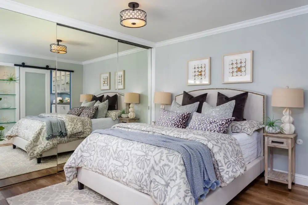
A Danville bedroom with soft gray wall paint and mirrored closet doors, showing how cooler neutrals create a calm, modern feel. The reflective surfaces amplify light and subtly shift the paint tone throughout the day.
We were doing a full repaint on an open-plan Walnut Creek ranch — kitchen, dining, living room all connected, no walls dividing them. The clients wanted everything to feel "unified but not boring." They'd been living with the same builder-beige for twelve years and it had finally gotten to them. When I asked if they wanted everything the same color or something different in each zone, they looked at each other and said: "Can't it be both?"
Yes. Actually, yes it can. That's exactly what color zoning does — and when it works, you walk through a home that feels designed, not just painted.
What Color Zoning Actually Is
Trade Term Explained
Color zoning is the practice of using coordinated paint colors — or shifts in sheen, tone, or depth — to visually separate functional areas in an open floor plan. Instead of painting hard walls that stop the eye, you create gentle transitions that tell the eye "this is the kitchen" and "this is the living room" without actually putting up a wall. The zones feel distinct but connected — like chapters in a book written with the same voice.
Open-plan living has been the dominant layout preference in East Bay remodels for the past fifteen years. It creates bright, connected spaces that feel modern and social. It also creates a genuine design challenge: how do you make a space feel organized and purposeful when there are no physical divisions?
Color is the answer most designers reach for. But undisciplined color in an open plan is worse than one color throughout — it feels chaotic and disconnected. The key is understanding how to use color zones as a system, not a collection of individual room choices.
The Foundation: One Undertone Family, Multiple Tones
The most important rule of color zoning in an open plan: all your wall colors must share the same undertone family. Warm, cool, or neutral — pick one and stay in it. Mixing undertone families across zones creates visual tension that the eye reads as "something's wrong" even when you can't identify what.
Within your undertone family, you can vary depth, saturation, and sheen as much as you like. The kitchen might be your lightest tone for energy and brightness. The dining room a mid-depth tone for warmth. The living room a slightly deeper shade for coziness. They're all different, but they're all speaking the same language.
| Zone | Tone Strategy | Sheen | Why |
|---|---|---|---|
| Kitchen | Lighter version of palette | Satin | Bright, energetic, easy to clean |
| Dining | Mid-depth tone | Eggshell | Warm and intimate for gathering |
| Living Room | Slightly deeper or anchor tone | Eggshell | Cozy and grounding |
| Hallway/Transition | Match or between kitchen and living | Eggshell or satin | Connects zones without interrupting flow |
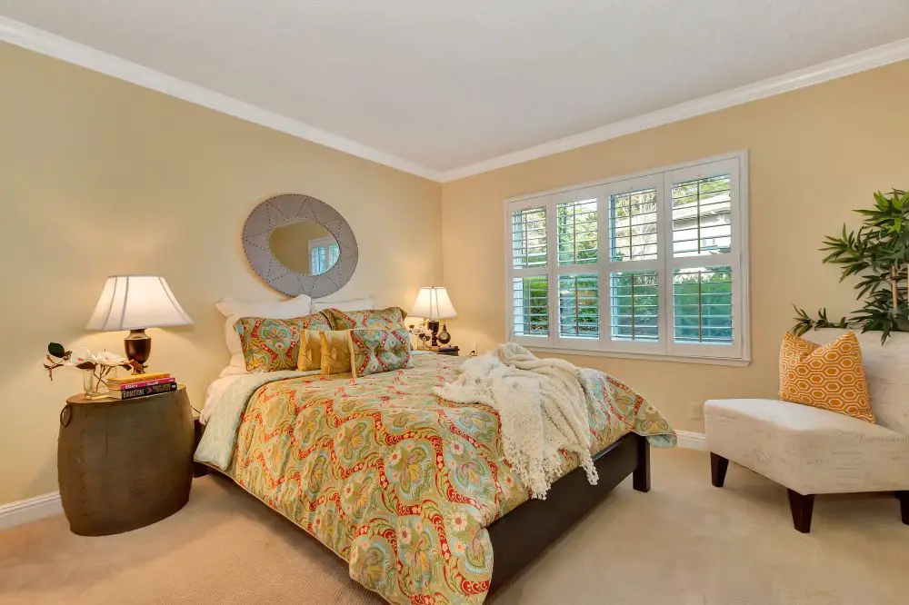
A Lafayette bedroom featuring warm beige painted walls and classic white trim, demonstrating how warmer neutrals create a cozy, inviting atmosphere. This palette works especially well in spaces with softer lighting.
Where Color Changes Should Happen
This is the technical decision most people get wrong. In an open plan, you can't just stop painting mid-wall because you've crossed an invisible line between the dining room and the living room. The change needs to land on a structural or visual cue.
Natural transition points that work:
- A ceiling beam or soffit that marks where the kitchen ends and living begins
- A column or half-wall (even a low one)
- A change in flooring material — tile to hardwood, for instance
- A built-in bookcase, island, or cabinetry run
- An interior corner where two walls meet at right angles
What doesn't work: stopping paint in the middle of a continuous wall with no structural reason for it. The eye follows architecture, not invisible room boundaries. If the paint change doesn't align with something real, it looks like a mistake.
Rossmoor Tip
Rossmoor condos often have open living/dining plans that flow directly into each other without any structural break. In these cases, we typically recommend one color throughout the connected space — and create differentiation through furniture, rugs, and lighting rather than paint. The units are often compact enough that two different wall colors in the main living area can feel busy rather than intentional. One warm neutral, consistent trim, and well-placed area rugs go a long way.
The Non-Negotiables: Trim and Ceiling Stay Consistent
Whatever happens on the walls, trim and ceiling stay the same throughout the connected space. This is the anchor that makes color zoning work instead of look chaotic.
One trim white from the front door to the back of the house. One ceiling color (or one tinted approach applied consistently). These constants allow the wall color to shift without the space feeling fractured.
Not sure which trim white to use? Read Trim It Right: Choosing the Perfect White for Your Molding & Doors — your trim white is the thread that holds every zone together.
Building Your Open-Plan Palette
Here's the process we use when helping Walnut Creek and East Bay clients build a color-zoning palette from scratch:
- Start with your fixed elements. Flooring, cabinetry, countertops. These don't change, and they set the undertone direction. Warm oak floors = warm palette. Gray stone counters = cool or balanced palette.
- Pick your anchor color first. This is the color that goes in your largest or most prominent zone — usually the living room. Everything else builds from here.
- Find your lighter version for the kitchen. Take your anchor color and go 15–25% lighter in the same undertone family. This keeps the kitchen feeling bright and open without disconnecting it from the rest of the space.
- Find your mid-tone for dining. Between the kitchen and living room in depth. It should feel warmer and more intimate than the kitchen, slightly lighter than the living room.
- Set your trim and ceiling. One white throughout. Decide whether you're matching ceiling to trim or tinting the ceiling to the wall color. Apply it everywhere.
- Sample all three wall colors on boards and view them together — in the same room, in the same light, at the same time of day. They should look like a family, not three strangers.
For the full sampling process: Sample Smarter: Big Boards, Real Light, No Tiny Chips or Guesswork
Example Warm Palette for an East Bay Open Plan
| Zone | Color | Undertone | LRV |
|---|---|---|---|
| Kitchen | BM White Dove (OC-17) on walls | Warm cream | 85 |
| Dining | BM Edgecomb Gray (HC-173) | Warm gray-beige | 63 |
| Living Room | BM Revere Pewter (HC-172) | Warm brown-gray | 55 |
| Trim throughout | BM White Dove (OC-17) | Warm cream | 85 |
| Ceiling throughout | BM White Dove tinted 20% lighter | Warm cream | ~90 |
These three colors share a warm, grounded undertone and step from light (kitchen) to mid (dining) to deep (living). They feel like a system. That's the goal.
Candi's Take
The most common mistake I see in open-plan color attempts is trying to make each zone feel completely individual. People pick colors they love room by room without thinking about how they'll look standing at one end of the house and seeing all three at once. Color zoning isn't about three great individual colors — it's about three colors that are great together. That requires seeing them as a palette, not as separate decisions.
When to Skip Color Zoning and Just Use One Color
Color zoning isn't always the right answer. Sometimes the simplest solution is best:
- When the space is small. Multiple colors in a small open plan can feel cluttered and busy. One warm neutral throughout lets the space breathe.
- When the transition points are unclear. If there's no architectural cue where zones would change, forcing a color change looks arbitrary.
- When you're preparing to sell. For resale, one cohesive neutral throughout is almost always the strongest strategy. Buyers need to see themselves in the space, and a unified palette helps them do that faster.
If you're painting for resale, read this first: Market-Smart Neutrals: Paint Colors Buyers Love Without Making Your Home Bland
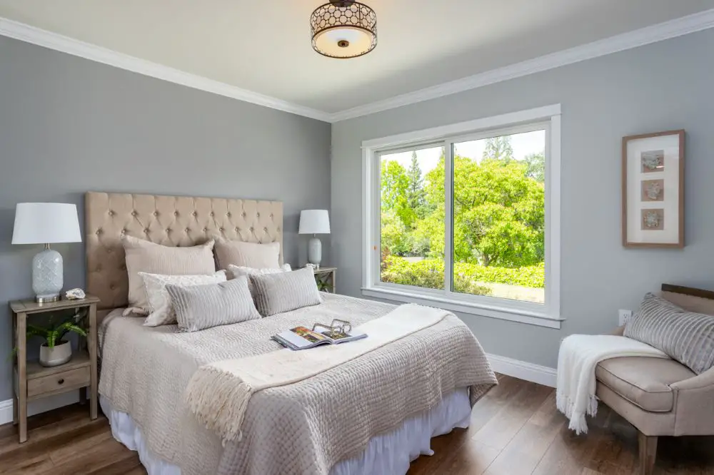
A bedroom with soft gray wall paint in bright natural light, highlighting how undertones become more visible depending on time of day. This reinforces the importance of testing paint colors in real lighting conditions.
Frequently Asked Questions
How many colors should I use in an open floor plan?
Three to four is the sweet spot. One base/anchor color for the dominant space, one lighter version for the kitchen or adjacent zone, one mid-tone for dining or transition areas. Plus one trim white throughout. More than that and you're no longer creating zones — you're creating chaos.
Do I have to change colors in every zone, or can I use sheen to create separation?
Sheen variation alone can work beautifully, especially in a smaller space. Eggshell in the living room, satin in the kitchen — same color, different finish. It creates subtle visual separation without a color change. This is one of our favorite tricks for Rossmoor condos where the open plan is compact.
What if my open plan doesn't have any architectural transitions — just open walls?
Furniture becomes your dividing line. A sofa facing a particular direction, a rug, a pendant light cluster over the dining table — these elements can suggest zones that a color change then reinforces. Or, use one color throughout and let the furniture do all the work.
Ready to Build a Color Story That Flows?
Open-plan color is one of the more nuanced paint decisions out there. We help Rossmoor, Walnut Creek, Orinda, and Lafayette homeowners build palettes that feel intentional from every angle. Let's talk through your space.
Contact Toupin Construction · 925-937-4200
Toupin Construction
Ready to start your remodel?
Whether you're dreaming of a new kitchen, a spa-worthy bathroom, or a whole-home transformation — we’d love to hear about your project. Reach out and let's talk.
‹ Back
Comments