


By using our website, you agree to the use of cookies as described in our Cookie Policy
Blog
Trim It Right: Choosing the Perfect White for Your Molding & Doors

Best White Paint for Trim & Doors: How to Choose and Why It Matters
We were wrapping up a kitchen remodel in Rossmoor a couple years ago — new cabinets, new counters, fresh paint throughout. The homeowner came by for the walkthrough, stood in the doorway, and said "It's beautiful, but something feels off." We looked together for about thirty seconds before we both saw it: the new crisp bright-white trim looked almost blue against her warm beige walls. She'd used the same white she'd always used. The walls were the new element. But the mismatch between a cool trim white and warm wall tone was subtle enough that she couldn't name it, and jarring enough that she couldn't un-see it once she did.
Trim color is the detail everyone thinks doesn't matter until it's wrong. Here's how to get it right the first time.
Why Trim White Is More Complicated Than It Looks
There are somewhere north of 150 whites in a standard Benjamin Moore collection. Most people look at them and see approximately one color — white — in various levels of brightness. But every one of those whites has an undertone: a subtle hue beneath the surface that only reveals itself in context, next to other colors, under real light.
Pick a trim white with the wrong undertone for your wall color and your trim will read as a completely different color than you intended. Your crisp white becomes dingy. Or it reads blue. Or it makes your warm walls look yellow by comparison. None of that is what you're going for.
Trade Term Explained
Undertone is the secondary hue embedded in any paint color. Hold a "white" chip next to a piece of bright white printer paper — if the chip reads slightly yellow, pink, or cream, it's warm. If it reads blue, gray, or green, it's cool. Warm undertones work best with beige, greige, and wood-toned interiors. Cool undertones work best with gray, navy, and modern minimal spaces.
Warm vs. Cool White Trim: How to Decide
The single most important rule: match the undertone temperature of your trim to the undertone of your wall color.
| Trim Type | Undertone | Best With | Popular Options |
|---|---|---|---|
| Warm White | Yellow, cream, or pink | Beige, greige, warm gray walls; oak, walnut, maple floors | BM White Dove (OC-17, LRV 85), SW Alabaster (SW 7008, LRV 82) |
| Neutral White | Balanced — no strong lean | Mixed palettes, transitional homes; most East Bay ranches | BM Simply White (OC-117), SW Pure White (SW 7005) |
| Cool White | Blue or gray | Cool gray, navy, black walls; chrome, nickel, or matte black hardware | BM Chantilly Lace (OC-65, LRV 90), SW High Reflective White (SW 7757, LRV 93) |
White Dove is the most forgiving warm white we use. It works in almost every room in almost every light condition in the East Bay. If you're not sure whether your space is warm or cool, White Dove is almost always a safe starting point.
Chantilly Lace is the other end — bright, cool, absolutely beautiful against bold wall colors or in a modern space. But it will fight warm walls, warm floors, and warm hardware. Use it intentionally.
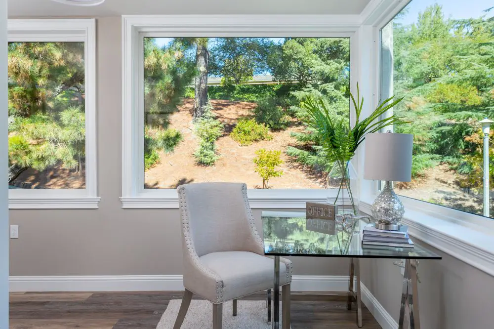
A bright corner office with large windows and white trim, demonstrating how trim color enhances natural light and defines the architecture of the space. The consistent white trim keeps the room feeling fresh, open, and cohesive.
How Light Changes White Trim
East Bay homes have dramatically different light depending on which direction the windows face, the age of the home, the surrounding landscape, and the time of year. This matters for trim white selection as much as it matters for wall color.
| Room Direction | Natural Light Character | Recommended Trim White |
|---|---|---|
| North-facing | Cool, flat, blue-gray cast | Warm whites (White Dove, Alabaster) to offset the cool light |
| South-facing | Warm, golden, consistently bright | Neutral whites (Pure White, Simply White) to prevent yellowing |
| East-facing | Bright mornings, subdued afternoons | Balanced options (Simply White) that work in both conditions |
| West-facing | Strong afternoon sun, warm late light | Neutral to muted warm whites (SW Creamy) to avoid orange cast |
Rossmoor Note
Rossmoor's older construction (mostly 1960s–1970s) tends to have smaller windows relative to the square footage compared to newer construction. This means many units run cooler and more diffuse in their natural light — which is exactly why we lean warm on trim whites for Rossmoor projects. White Dove is probably our most-used trim color in the community, and it consistently holds its warmth under the filtered light.
Finish Matters as Much as Color
The sheen you choose for your trim white affects how the color reads — and how long it lasts. This is where most DIY paint jobs make a second mistake after the undertone problem.
| Surface | Recommended Finish | Why |
|---|---|---|
| Baseboards | Satin | Soft sheen, resists scuffs, blends minor imperfections in older trim |
| Door casings & window frames | Satin or Semi-Gloss | More durable than walls, highlights detail without being too shiny |
| Interior doors | Semi-Gloss | Most durable, easiest to clean, highlights door panel detail |
| Crown molding | Semi-Gloss | The slight shine draws the eye up and highlights the molding profile |
| Built-ins & cabinetry | Satin or Semi-Gloss | Depends on use frequency — kitchen built-ins warrant semi-gloss |
For the full breakdown of which sheen goes where in every room: Sheen Matters: Matte, Eggshell, Satin & Semi-Gloss by Room
Don't Forget Hardware
This is the step that gets skipped constantly. Your trim white needs to work with your hardware finish, not just your wall color.
- Warm brass, unlacquered bronze, aged gold → warm whites (White Dove, Alabaster)
- Polished or brushed nickel → neutral to cool whites (Simply White, Pure White)
- Chrome, satin chrome → cool whites (Chantilly Lace, High Reflective White)
- Matte black → depends on wall color; matte black is unusually flexible and works with both warm and cool whites
Warm brass door hardware against a bright cool white trim looks mismatched in person, even if you can't immediately identify why. The metal reads warm; the trim reads cold. They fight. Match them and the whole space feels more intentional.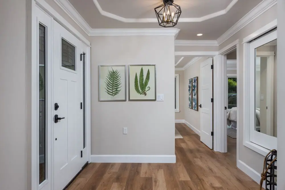
A Walnut Creek entryway featuring crisp white trim against soft neutral walls, highlighting how clean trim lines frame the space and add contrast. The bright white casing and crown molding create a polished, finished look that elevates even simple paint colors.
One Trim White Throughout the Whole House
This is one of the few "rules" in interior design that I actually follow religiously. One trim white. Applied to every baseboard, door casing, window frame, crown molding, and interior door in the house. No exceptions.
When trim white changes room to room — even subtly — the transition points feel wrong. The hall suddenly looks different from the living room. The bedroom feels disconnected from the rest of the house. One trim white creates visual continuity that the eye reads as "cohesive" even without knowing why.
Candi's Take
Every few months we get a call from someone who picked up a different white for the master bedroom to "go warmer" after they'd already done the rest of the house, and now it looks off. I totally understand the instinct — but save the warmth variation for a paint color, not the trim. One trim white throughout. It's the easiest way to make any home feel finished and professionally designed.
How to Test Your Trim White
Same process as any other color — boards, not chips. A few specific tips for white testing:
- Paint your sample board and hold it directly against your wall color sample. Undertone mismatch shows up immediately in comparison.
- Hold it against your flooring. Warm wood floors make cool whites pop; gray stone makes warm whites look yellow.
- Check it under your actual lighting — both daylight and whatever bulbs you use in the evening.
- Hold it next to your door hardware.
- View from across the room, not up close. Undertones read more clearly at distance.
Need the full board-testing method? Read Sample Smarter: Big Boards, Real Light, No Tiny Chips or Guesswork
Frequently Asked Questions
What's the most popular trim white in East Bay homes?
Benjamin Moore White Dove (OC-17) is by far the most commonly recommended trim white for Walnut Creek, Rossmoor, Orinda, and Lafayette homes. Its warm undertone is flexible enough to work with most wall colors and most natural light conditions in our area.
Can I use the same paint for trim and walls?
The color can match, but the finish should differ. Walls typically get eggshell or matte. Trim gets satin minimum, semi-gloss for doors and high-touch surfaces. Using wall paint on trim means it won't hold up and will scuff and mark quickly.
Should my trim and ceiling be the same white?
Often yes. Matching trim and ceiling white creates seamless flow, especially in smaller East Bay condos where visual continuity makes the space feel larger. You can also tint the ceiling 10–20% lighter than the wall color if you want a softer transition — that's another approach that works beautifully.
Let's Find the Right White for Your Home
Trim decisions are one of those things that seem small until they're not. We help East Bay homeowners in Rossmoor, Walnut Creek, Lafayette, and Orinda get this right — as part of a full repaint or just a color consultation before you commit. Give us a call.
Contact Toupin Construction · 925-937-4200‹ Back
Comments