


By using our website, you agree to the use of cookies as described in our Cookie Policy
Blog
Market-Smart Neutrals: Colors Buyers Love Without Making Your Home Bland

Market-Smart Neutrals: Paint Colors Buyers Love (Without Making Your Home Bland)
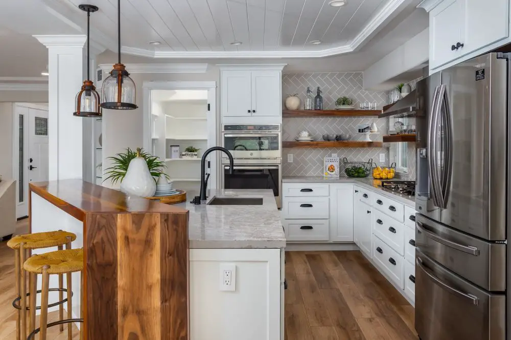
A bright Lafayette kitchen featuring warm white painted cabinetry, natural wood accents, and soft neutral finishes. This palette creates a clean, timeless look that appeals to buyers while still feeling warm and lived-in.
We painted a Rossmoor condo last year for a client who was getting ready to sell. She'd lived there for 22 years and loved her burgundy dining room, her forest green bedroom, the dusty rose bathroom. Loved every bit of it. And it had to go.
Not because those colors were wrong. They were beautiful, actually — and totally hers. But she wanted buyers to walk in and picture themselves living there, not feel like they were stepping into someone else's home. We repainted in warm neutrals, and the unit sold in eight days with multiple offers.
Market-smart neutrals aren't about being safe or settling. They're a strategic decision that keeps your home looking fresh, open, and move-in ready — without scrubbing the space of all character. Here's how to pick them right for an East Bay home.
What Makes a Neutral "Market-Smart"
Not all neutrals photograph well. Not all neutrals work in East Bay light. And not all neutrals feel warm and welcoming — some are just flat-out depressing in person even when they look gorgeous on a chip.
A market-smart neutral has three qualities:
- It photographs well. Listing photos are where buyers form their first impression. Colors with warm undertones read better on camera than cool, flat grays.
- It works across furniture styles. Buyers need to mentally move their sofa in. A versatile neutral does the heavy lifting for them.
- It holds up in your specific light. East Bay light varies wildly — foggy mornings in Orinda, golden afternoon sun in Walnut Creek, filtered shade in Rossmoor's tree-lined units. The neutral you pick needs to work in yours, not just in the paint store's fluorescent glow.
Trade Term Explained
LRV (Light Reflectance Value) is a number from 0 to 100 that tells you how much light a paint color reflects. 0 is pure black, 100 is pure white. For resale, aim for an LRV between 60 and 75 — bright enough to make rooms feel spacious, grounded enough to not look washed out or sterile.
The Best Market-Smart Neutrals for East Bay Homes
| Color | Type | Undertone | LRV | Best For |
|---|---|---|---|---|
| SW Agreeable Gray (SW 7029) | Greige | Warm gray-beige | 60 | Open-plan living spaces, condos |
| BM Edgecomb Gray (HC-173) | Greige | Balanced warm gray | 63 | Bedrooms, hallways, whole-home palette |
| BM White Dove (OC-17) | Warm White | Creamy yellow | 85 | Small rooms, condos, trim + walls matched |
| SW Alabaster (SW 7008) | Warm White | Soft cream | 82 | Transitional homes, any room with warm wood floors |
| BM Revere Pewter (HC-172) | Soft Taupe | Brown-gray | 55 | Accent walls, dens, bedrooms |
Rossmoor Specific
Rossmoor's filtered light — thanks to mature trees and the community's east-facing orientation in many buildings — makes warm neutrals like Agreeable Gray and White Dove particularly successful. Cool grays like Repose Gray can read icy or lavender-tinted in these conditions. We've seen it more times than we can count. Test before you commit.
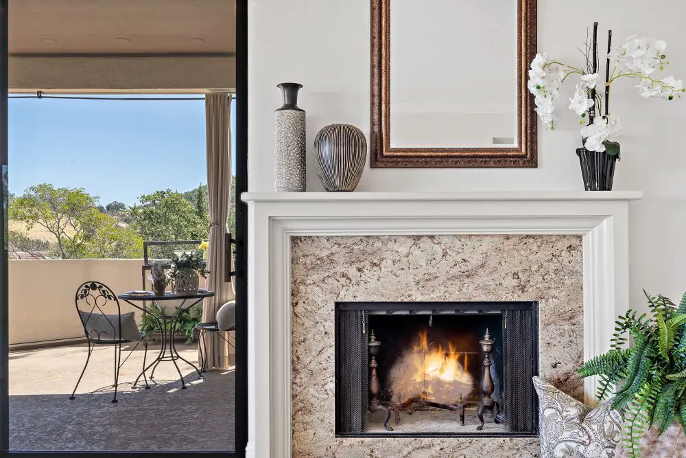
A Lafayette living space with soft neutral wall paint, a classic fireplace surround, and seamless indoor-outdoor flow. The light neutral palette enhances natural light and creates a calm, universally appealing environment for buyers.
Greige: The One Word You Need to Know
Greige (gray + beige) became the dominant resale neutral in the 2010s and it's still performing beautifully in East Bay listings. Here's why it works so well: it's warm enough to feel cozy in person, and neutral enough to not fight with buyers' furniture.
The key is choosing a greige that leans warm without going full beige. True beige can read yellow or orange under the wrong light. True gray can read lavender or blue. The sweet spot — a balanced greige with a slight warm lean — almost always works.
Agreeable Gray and Edgecomb Gray are our two most-recommended options. Between them, Agreeable Gray is slightly warmer and reads more beige; Edgecomb Gray is more balanced and cooler. Both photograph beautifully and work with almost any flooring type.
What "Warm" vs. "Cool" Actually Means at the Store
When you're at the paint store, hold your neutral chip next to a white piece of paper. If the chip looks slightly yellow, brown, or pink next to the paper — it's warm. If it looks gray, blue, or green — it's cool.
For resale in the East Bay, warm wins almost every time. Cool grays have their place in contemporary spaces with modern finishes, but they're unforgiving — they require the right flooring, the right lighting, and the right furniture to hold up. Warm neutrals cover a wider range of interiors and feel welcoming the moment someone walks through the door.
How to Build a Market-Smart Palette (Not Just a Wall Color)
A market-smart repaint isn't just about one wall color. It's a three-layer system:
- Wall color: your neutral (greige, warm white, or soft taupe)
- Trim color: one consistent white throughout the home — BM White Dove or SW Pure White both work beautifully
- Ceiling color: match the trim white OR tint the wall color 10–20% lighter for seamless flow
Keeping these three surfaces consistent throughout the home is one of the highest-value things you can do for resale. It makes the whole house feel larger, cleaner, and more intentional — without spending a dollar more than a standard repaint.
Need help with trim and ceiling whites? Read Trim, Doors & Ceilings: Crisp Whites, Soft Contrasts, and When to Match before you finalize your palette.
Testing Neutrals in Your Actual Home
This cannot be skipped. A greige that looks perfect in a Walnut Creek ranch with south-facing windows might look completely different in a north-facing Orinda living room. Paint stores can't tell you that. Only testing in your own home will.
Our process: paint 12x12 boards with two coats, no smaller. Move them through every room you're repainting. View them in morning, afternoon, and evening light. Hold them against your floor, your cabinets, your countertops. If a neutral still looks balanced and warm after all of that — it's the one.
We wrote a full guide on how to do this right: Sample Smarter: Big Boards, Real Light, No Tiny Chips or Guesswork
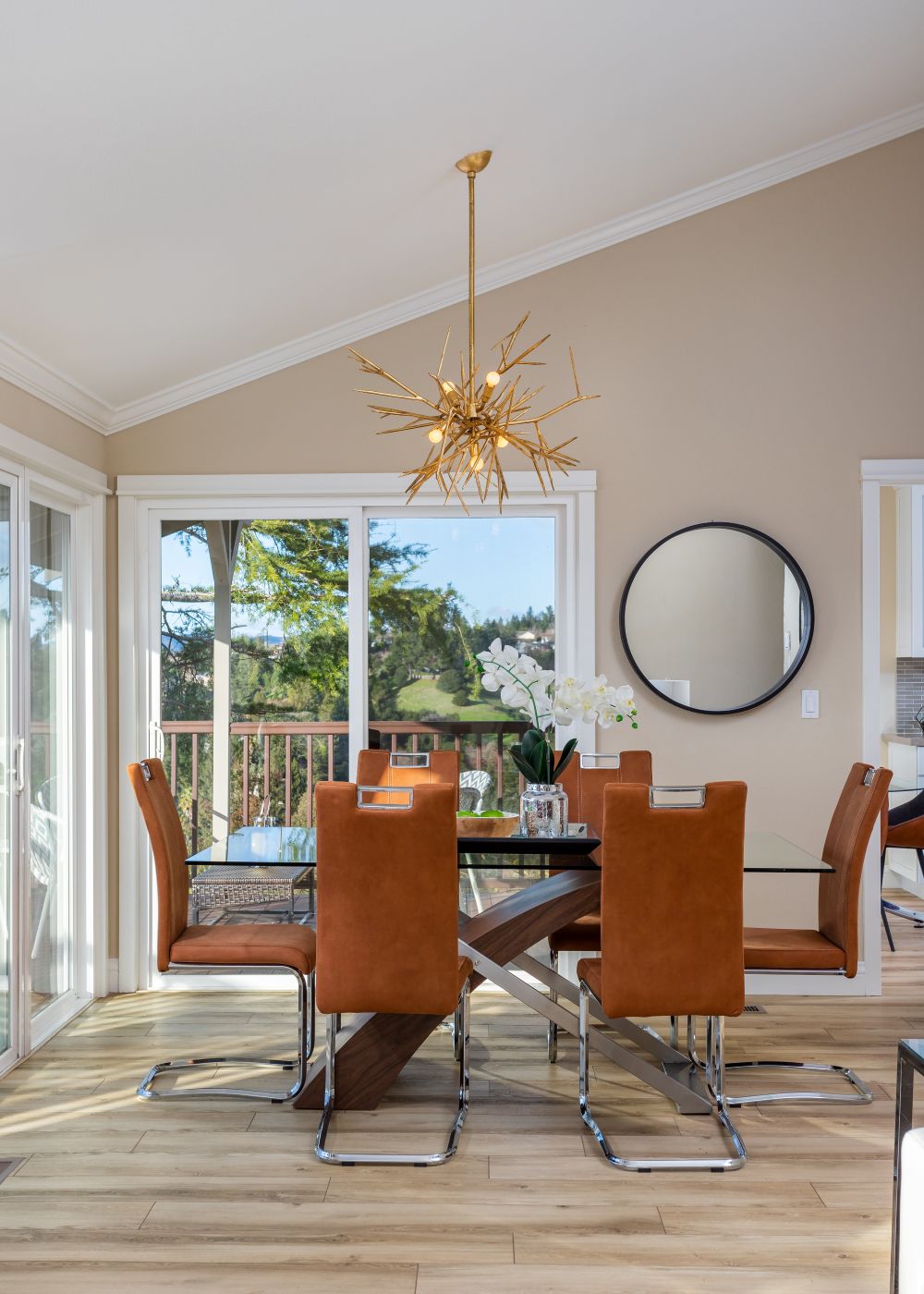
A Lafayette dining room featuring warm beige painted walls, modern lighting, and rich wood tones. The neutral color keeps the space versatile while allowing statement pieces to stand out—ideal for broad buyer appeal.
The Mistakes That Make Neutrals Feel Bland
Choosing too light. Very high-LRV neutrals (above 80) can read almost white in bright rooms — and in listing photos, they lose all their warmth. Stick to the 60–75 range for walls.
Ignoring sheen. Flat paint on walls + flat paint on trim + flat paint on ceilings = a room that looks unfinished even if the color is gorgeous. Layer your sheens: eggshell on walls, semi-gloss on trim, flat on ceilings. The contrast adds depth without adding drama.
Skipping the trim update. Old yellow trim against a fresh greige wall is worse than no repaint at all. Always refresh trim when you repaint walls for resale. It's the difference between "updated" and "patched."
Picking from a phone screen. Social media and Pinterest have made us all confident that we know what a color looks like from a photo. We don't. Colors shift dramatically between screens, print, and real life. Always — always — test in person.
Candi's Take
The best market-smart neutral is the one that makes your home feel like it was designed, not just painted. That means thinking beyond the wall color to the whole palette — trim, ceiling, sheen, and how light moves through your specific rooms. A two-hour paint consultation before a listing can be the difference between a quick sale and a price reduction. We've seen it happen both ways.
Frequently Asked Questions
What is greige and why does everyone use it for resale?
Greige is a blend of gray and beige — warm enough to feel inviting, neutral enough to work with most furniture styles. It photographs beautifully, appeals to a wide range of buyers, and tends to read "updated and move-in ready." That's why it dominates East Bay listings.
Can I use a true white for resale instead of a greige?
Yes, with the right undertone. Warm whites like White Dove and Alabaster work beautifully for resale — especially in smaller condos where a white-on-white palette with matched trim can make the space feel significantly larger. Avoid stark cool whites — they can feel institutional rather than inviting.
Do I really need to repaint the whole house or just the main rooms?
For resale, prioritize living spaces, kitchen, and primary bedroom — those are the rooms buyers photograph in their heads. Hallways and secondary bedrooms matter less, but if the color is jarring, it's worth addressing.
Thinking About Selling? Let's Get Your Colors Right.
We help East Bay homeowners in Rossmoor, Walnut Creek, Orinda, and Lafayette prepare their homes for market with paint color strategies that appeal to buyers without losing warmth. Call us before you list.
Talk to Toupin Construction · 925-937-4200
Toupin Construction
Ready to start your remodel?
Whether you're dreaming of a new kitchen, a spa-worthy bathroom, or a whole-home transformation — we’d love to hear about your project. Reach out and let's talk.
‹ Back
Comments