


By using our website, you agree to the use of cookies as described in our Cookie Policy
Blog
How to Sample Paint Colors: Big Boards, Real Light, No Guesswork
How to Sample Paint Colors: Big Boards, Real Light, No Guesswork
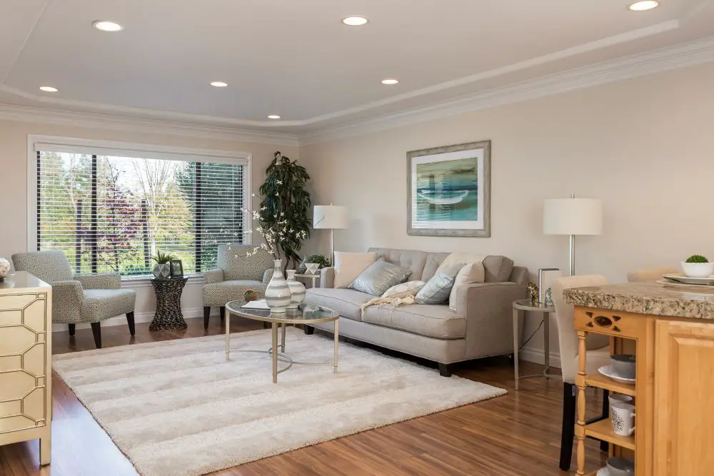
A living room showcasing warm neutral wall paint in natural daylight, demonstrating how paint colors shift depending on lighting conditions. This highlights why testing paint in real spaces—not just swatches—is essential before committing.
A client came to us last fall furious at the paint store. She'd picked a color called "Warm Linen" from a chip, bought two gallons, painted her entire hallway — and it came out looking like a manila envelope. She called it the wrong color. We told her gently: it's exactly the right color. It just behaved differently in her home than it did under the store's fluorescent lights.
This happens constantly, and it's almost entirely avoidable. Paint color is not a fixed thing. It shifts with light direction, time of day, bulb temperature, flooring, and what's on the surrounding walls. A chip at the store tells you almost nothing useful. A large board in your actual home tells you everything.
Here's the sampling process we walk every client through before we touch a single wall.
Why the Paint Store Lies to You
Hardware store lighting is engineered to make paint look good — not to replicate your home. It's typically bright, cool, and uniform. That flatters certain colors and completely distorts others.
The undertone — the subtle color hiding beneath your paint — is what store lighting suppresses. A greige that looks perfectly balanced at the store might look lilac-tinted in your north-facing living room or yellow in your bright south kitchen. You'll never know until you bring it home.
Trade Term Explained
Kelvin (K) is the unit used to measure light color temperature. Lower Kelvin numbers (2700K) produce warm, amber-toned light — the kind that feels cozy and golden. Higher Kelvin numbers (4000K and above) produce cool, crisp, blue-toned light. The bulbs in your home directly affect how your paint color reads, which is why testing under your actual bulbs matters as much as testing in natural light.
The Big Board Method
Forget small chips. This is the process that actually works.
Step 1
Buy sample pots, not quarts. Most paint brands sell sample sizes for $4–8. That's all you need for the board method. Don't buy a full quart until you've tested.
Step 2
Paint large boards — at least 12x12 inches, ideally larger. Use foam core, drywall scraps, or primed poster board. Apply two full coats and let them dry completely. Wet paint always looks darker than dry paint. Always.
Step 3
Label each board clearly with the brand, color name, and finish. You'll thank yourself later when you're comparing two very similar greiges and can't remember which is which.
Step 4
Move boards around the room. Don't just prop them in one corner. Lean them against the north wall, the south wall, next to the window, away from the window. Color reads differently depending on what light source is hitting it.
Step 5
View at three times of day: morning, midday, and evening. Morning light is cooler and more directional. Midday is brightest. Evening, under your artificial bulbs, is often the most revealing — it's when undertones you couldn't see all day suddenly appear.
Step 6
Hold boards next to your flooring, cabinets, and trim. Color never exists alone on a wall. It reacts to everything around it. Warm oak floors make white walls look cooler. Gray stone tile makes beige walls look yellow. Always test in context.
Step 7
The last surviving color wins. After a full day of testing, if one color still looks balanced and beautiful — that's your color. If you're still not sure, eliminate one and sleep on the other two.
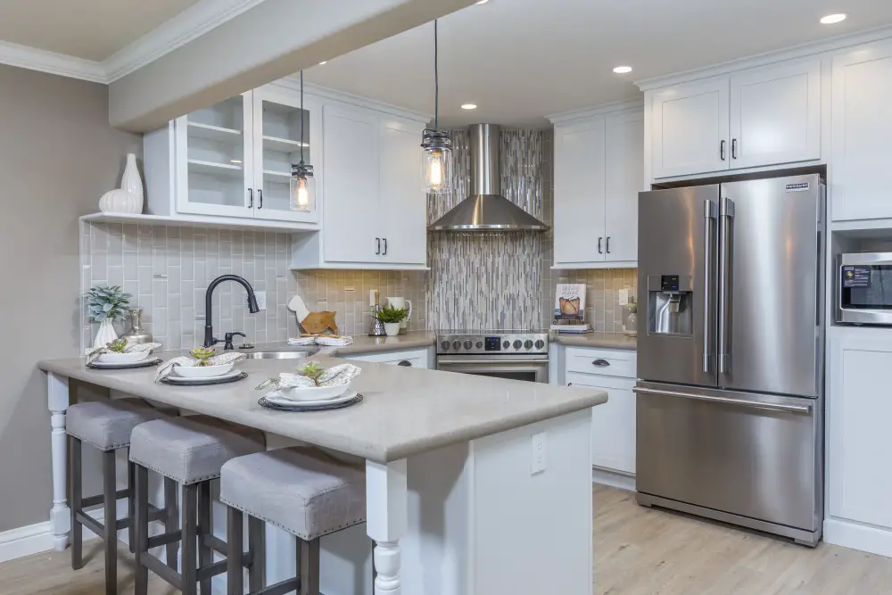
A kitchen with white cabinetry and layered lighting, illustrating how paint colors can appear different under recessed lights versus natural light. Sampling in multiple lighting conditions helps avoid surprises.
Light Direction in East Bay Homes
One thing I always ask before helping someone pick a color: which direction do the windows face? It's genuinely one of the most important questions in paint selection, and most people have never thought about it.
| Direction | Light Quality | What It Does to Color | Best Paint Types |
|---|---|---|---|
| North-facing | Cool, consistent, blue-gray | Cools undertones, can make warm neutrals read gray | Warm whites, cream-toned greiges |
| South-facing | Warm, golden, bright all day | Amplifies warm undertones; warm whites can go yellow | Balanced neutrals, mid-range grays |
| East-facing | Bright AM, dim PM | Great morning light, room darkens significantly by afternoon | Soft warm greens, warm whites |
| West-facing | Muted AM, intense warm PM | Afternoon light can wash out color; evening reads orange-warm | Muted taupes, warm mid-tones |
Rossmoor Specific
Many Rossmoor units have limited direct sunlight due to the community's mature trees and the orientation of the buildings. This filtered, diffused light is soft and forgiving — but it can cool down warm neutrals faster than expected. In our experience, Rossmoor interiors often benefit from going slightly warmer on the color scale than you'd originally choose. What looks a touch warm on a board frequently reads perfect once on the walls.
Artificial Lighting: The Sampling Step Everyone Skips
Most people test their boards during the day and call it done. That's a mistake. The color you live with in the evening — under your actual bulbs — is often more revealing than anything you see in daylight.
- 2700K bulbs (warm white) add amber to everything. Warm neutrals get warmer. Cool whites gain a creamy glow.
- 3000K bulbs (soft white) are more balanced — a popular choice for kitchens and living areas.
- 4000K bulbs (cool white) are crisp and sharp. They reveal undertones clearly and can make warm neutrals look cooler than expected.
If you're changing your lightbulbs during a remodel — which we often recommend — test your paint samples under the new bulbs, not the old ones.
Wondering which sheen to use once you've landed on a color? Read Sheen Matters: Matte, Eggshell, Satin & Semi-Gloss by Room — sheen changes how color reads just as much as light does.
Comparing Multiple Colors Like a Designer
When you're down to two or three finalists, here's how to make the final call:
- Line up all boards on the same wall in the same light.
- Step back 8–10 feet. Close distance makes undertones disappear; from across the room they become obvious.
- Squint. Really. Squinting reduces detail and lets you see tone without distraction.
- Eliminate the one that reads wrong in evening light — that's the version you'll live with most.
- Sleep on the remaining option. If it still looks right the next morning, order the paint.
Candi's Take
I've watched people stand in front of sample boards for 45 minutes and still pick wrong because they were looking too closely, in one light, against a different color wall than the one they were painting. The system I just described above isn't complicated — but it takes a full day. Do the work. A gallon of the wrong color costs you nothing compared to the time and money of repainting a room you hate living in.
What NOT to Do When Sampling Paint
Don't paint directly on a colored wall. Your existing wall color will bleed through and change how the sample reads. Always use boards primed to a neutral base.
Don't choose from a phone screen or Pinterest photo. Color on screens is calibrated to look good on that screen — not to match reality. What looks like the perfect soft sage on Instagram might be a significantly more saturated green on your walls.
Don't test only one sample. Always test at least two options. You need comparison to see undertone; a color in isolation can look completely different next to a competitor.
Don't skip the floor comparison. Flooring is fixed. Your paint choice has to work with it. Always hold your sample boards against your floor before committing.
Once you've chosen your color, learn how to choose the right white for trim and ceiling: Trim It Right: Choosing the Perfect White for Your Molding & Doors
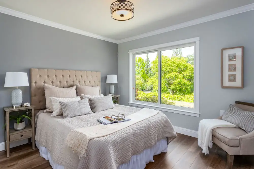
A bedroom with soft gray painted walls in bright natural light, showing how undertones become more visible throughout the day. Testing large paint samples helps confirm the right shade before final selection.
Frequently Asked Questions
Why doesn't my paint color look like the chip?
Store chips are photographed and printed under controlled lighting designed to look appealing — not to match your home's light. Chips are also small, which makes undertones harder to read. Big boards in your real light tell the real story.
How many sample colors should I test?
Three is ideal. Fewer than two and you have no comparison; more than four and you'll overwhelm yourself. Start with three that you're genuinely considering, eliminate one after a day of testing, and compare the final two for another day.
What size board should I use?
At least 12x12 inches. Bigger is better — some designers go 16x20 or even larger. The more surface area you're seeing, the more accurately you can read undertone and reflectivity.
Should I sample in every room or just the main space?
Sample in every distinct lighting condition. If your living room and kitchen share the same light source and direction, one location is fine. But if you're painting a south-facing bedroom and a north-facing hallway with the same color, test both spaces independently — the results may surprise you.
Still Not Sure? We Help with This Every Day.
Color selection is one of those things that sounds simple until you're staring at three nearly identical greiges at 4pm wondering which one goes yellow. We help East Bay homeowners in Rossmoor, Walnut Creek, Orinda, and Lafayette navigate this — come on in or give us a call.
Contact Toupin Construction · 925-937-4200
Toupin Construction
Ready to start your remodel?
Whether you're dreaming of a new kitchen, a spa-worthy bathroom, or a whole-home transformation — we’d love to hear about your project. Reach out and let's talk.
‹ Back
Comments