


By using our website, you agree to the use of cookies as described in our Cookie Policy
Blog
Trim, Doors & Ceilings: How to Choose the Right White (and When to Match)

Trim, Doors & Ceilings: How to Choose the Right White (and When to Match)
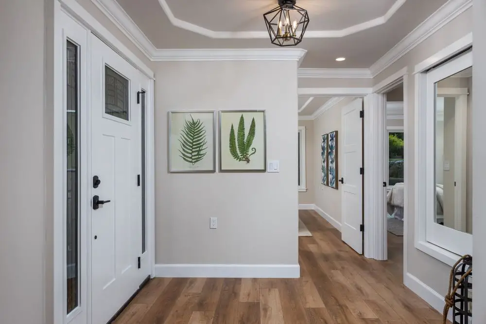
A bright Walnut Creek entryway featuring clean white trim, a paneled front door, and a subtle coffered ceiling that adds dimension while maintaining a soft, neutral contrast throughout the space.
There's a moment in almost every repaint where someone points at the trim and says, "Just use the same white we used everywhere else." I used to wince every time I heard it. Now I just ask: "Which white? The ceiling white, the trim white, or the door white?" That usually stops the conversation long enough to have the right one.
Here's the truth about white paint: it's not a single color. It's a category with hundreds of variations, each with its own undertone, finish, and personality. The wrong white on your trim can make your walls look dirty. The wrong white on your ceiling can make the room feel lower. And mixing whites without a plan is one of the most common reasons a freshly painted room still feels "off."
Let me walk you through how we think about this — because after 40 years painting East Bay homes, we've seen every combination of white gone wrong, and we know what actually works.
Why Trim, Doors, and Ceilings Each Need Their Own Thinking
These three surfaces aren't just "everything that isn't the wall." They each play a different role in the room:
- Trim (baseboards, door casings, window frames) frames the room and defines transitions. It's the edge of everything.
- Doors are surfaces people touch constantly. They need to be durable and slightly bolder visually than the trim — they're a focal point.
- Ceilings are the "fifth wall" — they set the perceived height of the room and bounce light back down onto everything else.
When these three surfaces feel cohesive, the whole room feels pulled together. When they clash — even subtly — something just feels wrong, and most people can't name what it is.
The ceiling is doing more work than you think. See Ceiling Paint 101: Yes, It's a Thing (and Yes, It Matters) for the full breakdown.
Understanding White Undertones
Trade Term Explained
Undertone is the subtle color hiding beneath a paint's surface hue. Every white has one — it might be yellow, cream, pink, gray, or blue. You won't see it on the chip at the store, but you'll see it the moment it goes on your wall next to your floors and cabinets. Warm undertones (yellow, cream, red) feel cozy. Cool undertones (blue, gray) feel crisp and modern.
The most important rule when choosing whites for trim, doors, and ceilings: match your undertone temperature. Warm walls need warm whites. Cool walls need cool whites. When you mix a warm wall color with a cool bright white trim, both colors start fighting each other — the trim looks harsh and the wall suddenly looks dingy.
| Type | Undertone | Works Best With | Examples |
|---|---|---|---|
| Warm White | Yellow, cream, red | Beige, greige, warm gray walls; oak and walnut floors | BM White Dove (OC-17), SW Alabaster (SW 7008) |
| Neutral White | Balanced — neither warm nor cool | Mixed palettes, transitional homes | BM Simply White (OC-117), SW Pure White (SW 7005) |
| Cool White | Blue, gray | Cool gray, navy, black, or modern minimalist walls | BM Chantilly Lace (OC-65), SW High Reflective White (SW 7757) |
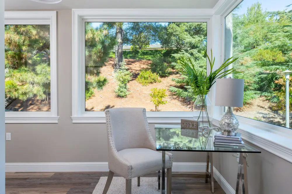
A light-filled corner in a Walnut Creek home showcasing expansive windows with crisp white trim, creating a soft contrast against neutral walls and enhancing the connection to the outdoors.
When to Match vs. When to Contrast
This is the question I get most often, and the answer isn't as complicated as it seems.
Match trim, doors, and ceiling color when: your architecture is detailed (lots of molding, casings, built-ins) or your rooms are smaller. One white across everything expands the space visually and keeps intricate details from competing.
Create contrast when: you want definition and drama. The most classic version of this is high-contrast wall colors — deep navy, sage green, warm charcoal — against crisp white trim. The contrast makes both surfaces look intentional.
A middle path that almost always works: match the trim and door white, and tint the ceiling to be 10–20% lighter than the wall color. This creates seamless flow from wall to ceiling without the harsh cut you get when two very different whites meet in the same corner.
Rossmoor Tip
In open-plan Rossmoor condos where rooms flow into each other without hard transitions, using one trim white throughout the unit is particularly important. It visually connects the spaces and makes the whole unit feel larger and more cohesive — a real asset when you're working within a fixed footprint.
How Light Direction Changes Your White
East Bay homes get very different light depending on which direction they face. This matters enormously for white selection — the same white can look completely different in a north-facing Walnut Creek living room versus a south-facing Rossmoor bedroom.
| Room Direction | Light Quality | Best Trim White | Why |
|---|---|---|---|
| North-facing | Cool, blue-gray | Warm whites (White Dove, Alabaster) | Balances the cool light, keeps trim from reading gray |
| South-facing | Warm, golden | Neutral whites (Pure White) | Prevents warm whites from looking yellowed by afternoon sun |
| East-facing | Bright AM, soft PM | Balanced whites (Simply White) | Handles the swing from crisp morning to dim afternoon |
| West-facing | Intense afternoon | Muted warm neutrals (SW Creamy) | Prevents the room from looking washed out at golden hour |
Artificial lighting matters too. Warm bulbs (2700K) soften and amber-ize your whites. Cool bulbs (4000K and up) sharpen them and reveal undertones more clearly. Always test your sample swatches under both bulb types before committing.
Need help choosing the right light temperature alongside your paint? Visit our Painting Services page — we coordinate paint selections with lighting decisions on every project.
Sheen Choices for Each Surface
White paint and sheen aren't separate decisions — they work together. Here's how to pair them:
| Surface | Recommended Finish | Why |
|---|---|---|
| Walls | Matte or Eggshell | Hides imperfections, soft glow without glare |
| Baseboards & Trim | Satin | Subtle sheen, scuff resistant, easy to wipe clean |
| Doors & High-Touch Areas | Semi-Gloss | Hardest finish, shows detail, easy to clean |
| Ceilings (standard) | Flat | Hides imperfections, no glare, makes room feel taller |
| Ceilings (humid rooms) | Eggshell or Satin | Resists moisture better than flat |
Candi's Take
We always use semi-gloss on interior doors and satin on baseboards. I know some designers say satin everywhere for a "softer, more modern" look, and that works great — but the moment you have kids or pets or anyone who touches door frames while walking through, you'll be grateful for that semi-gloss. It wipes clean. Satin needs a little more care. Both look beautiful. Choose based on your real life, not your ideal life.
How to Test Whites Before You Commit
Don't pick white paint from a chip at the store. I know it feels like white is white, but it genuinely isn't. Here's the right process:
- Get sample pots of your top 2–3 whites.
- Paint 12x12 boards with two full coats. Let them dry completely — wet paint always looks darker.
- Move the boards around the room and hold them against your wall color, trim, floors, and cabinets.
- View them in morning light, midday, and evening under your actual bulbs.
- The white that still feels right after all of that? That's your white.
We cover the full board-sampling technique in detail here: Sample Smarter: Big Boards, Real Light, No Tiny Chips or Guesswork
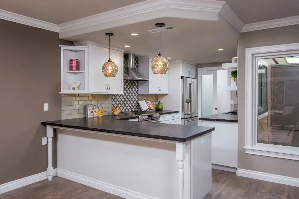
A remodeled Walnut Creek kitchen featuring white cabinetry, detailed crown molding, and ceiling accents paired with darker countertops to create a balanced, soft-contrast design.
Common White Mistakes We See on Every Block
Using different trim whites room to room. It happens gradually — you pick a white for the living room, a slightly different one for the bedroom, another for the hall. By the time you step back and look at the whole house, nothing connects. One trim white, applied everywhere. That's the rule.
Bright white trim with warm walls. Bright white (cool undertone) next to warm greige or beige walls creates visual tension. The walls start looking yellow, the trim looks sterile. Match undertone temperatures.
Forgetting hardware. Warm brass hardware with a cool bright white trim will fight each other. Warm whites pair better with brass, unlacquered bronze, and aged gold. Cool whites pair better with chrome, nickel, and matte black.
Using matte on trim. Flat paint on baseboards gets scuffed, scratched, and dirty within weeks. Satin minimum, semi-gloss preferred.
Our Go-To Whites for East Bay Homes
These four cover almost every situation we encounter in Walnut Creek, Rossmoor, Orinda, and Lafayette:
- BM White Dove (OC-17) — The warm-white workhorse. Beautiful with beige, greige, and warm wood floors. Works in almost any light.
- SW Alabaster (SW 7008) — Slightly warmer and softer than White Dove. Great for traditional or farmhouse interiors.
- BM Simply White (OC-117) — The true neutral. Works when you can't quite commit to warm or cool. Forgiving under most light conditions.
- BM Chantilly Lace (OC-65) — The crisp cool white. Beautiful against navy, charcoal, and bold wall colors. Modern and sharp.
Frequently Asked Questions
Should trim, doors, and ceilings all be the same white?
Usually yes — especially for trim and doors. Matching creates flow and makes spaces feel larger. For ceilings, you can match the trim white OR tint the wall color slightly lighter. Both work; it depends on the look you're after.
What's the difference between White Dove and Chantilly Lace?
White Dove has a warm, creamy undertone. Chantilly Lace is bright and cool with virtually no undertone — it reads as true white. White Dove is warmer and more forgiving; Chantilly Lace is crisper and more modern.
Does the finish I choose for trim change the color?
Yes. Semi-gloss reflects more light, which makes the white appear brighter and slightly lighter than the same color in satin. It's a subtle difference but worth knowing when you're comparing samples.
Ready to Get Your Whites Right?
Choosing trim and ceiling whites is one of those decisions that looks simple until you're standing in the store with 30 chips and no idea. We help homeowners in Rossmoor, Walnut Creek, Lafayette, and Orinda work through these decisions every day — no obligation, just honest guidance.
Talk to Toupin Construction · 925-937-4200
Toupin Construction
Ready to start your remodel?
Whether you're dreaming of a new kitchen, a spa-worthy bathroom, or a whole-home transformation — we’d love to hear about your project. Reach out and let's talk.
‹ Back
Comments