


By using our website, you agree to the use of cookies as described in our Cookie Policy
Blog
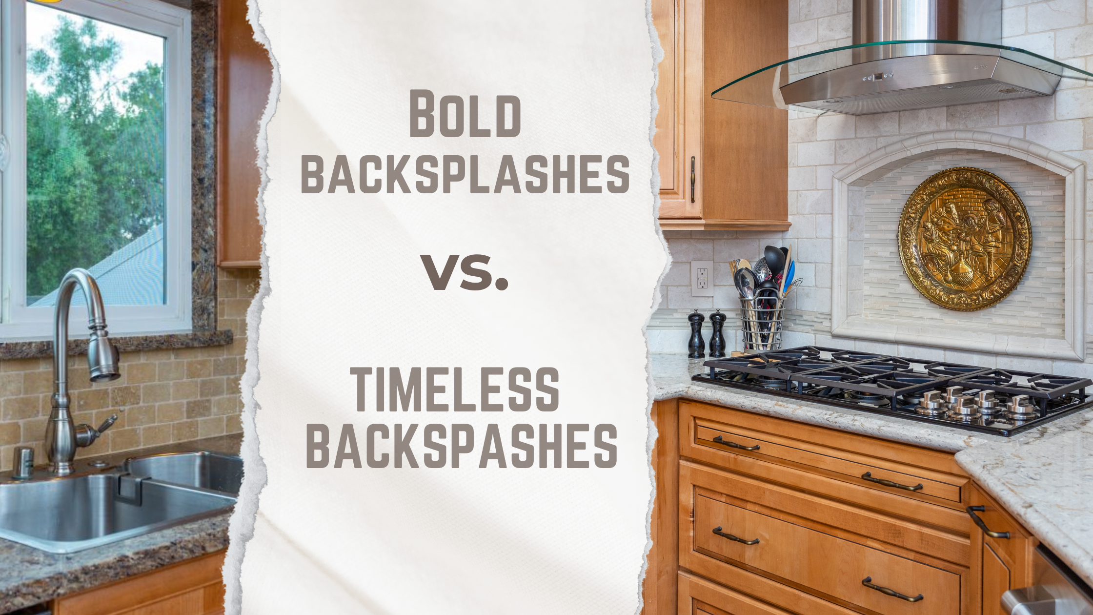
Bold Backsplash or Timeless Neutral? How to Actually Decide
Design · Global Tile · Deep Dive
Bold Backsplash or Timeless Neutral? How to Actually Decide
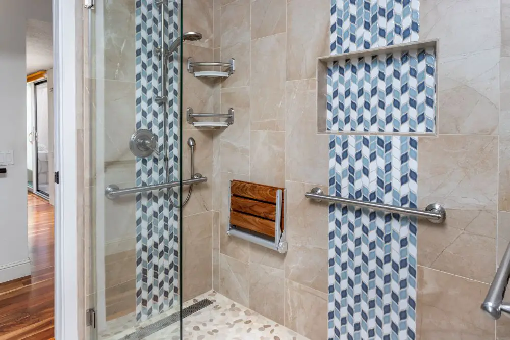
Accessible walk-in shower featuring curbless entry, grab bars, built-in bench, and vertical blue accent tile, combining safety with thoughtful design detail.
We finished a kitchen in Walnut Creek last year — navy cabinets, warm brass hardware, soft white zellige tile on the backsplash. The homeowner had been stuck for six months. She knew she wanted something with character, but every time she got close to committing to something bold, she'd pull back toward a clean subway tile. Classic. Safe. Something she wouldn't regret.
We set up a few samples on her actual counter, under her actual kitchen lights, and I watched the moment it clicked. "That one," she said, pointing at the zellige. "It's timeless, but it's still me." She's right — it is both of those things. And that's the whole point of this post.
Because here's what forty years of tile installs teaches you: the bold-vs.-neutral debate is usually the wrong frame. The better question is: bold and neutral where? And: what does "timeless" actually look like when someone's cooking dinner in it every night?
The Honest Case for Each
The Tiles We Actually Install — and What They're Like to Live With
Samples at a tile showroom look a certain way. On your wall, under your lights, next to your cabinets — they look different. Here's what we know from actually installing these tiles in East Bay and Rossmoor kitchens.
Trade Term: Field Tile vs. Feature Tile
Field tile is the main tile that covers most of the surface — typically simple, consistent, and restrained. Feature tile is the accent: a different material, pattern, or color used in a specific area to draw the eye. A neutral subway tile field with a zellige feature tile behind the range is the most popular combination we install in East Bay kitchens right now. You get the drama and the practicality in the same kitchen.
"The question isn't bold or neutral. It's bold where. One wall of zellige behind the range and the rest in clean subway tile is how you get both — without the whole kitchen fighting for attention."
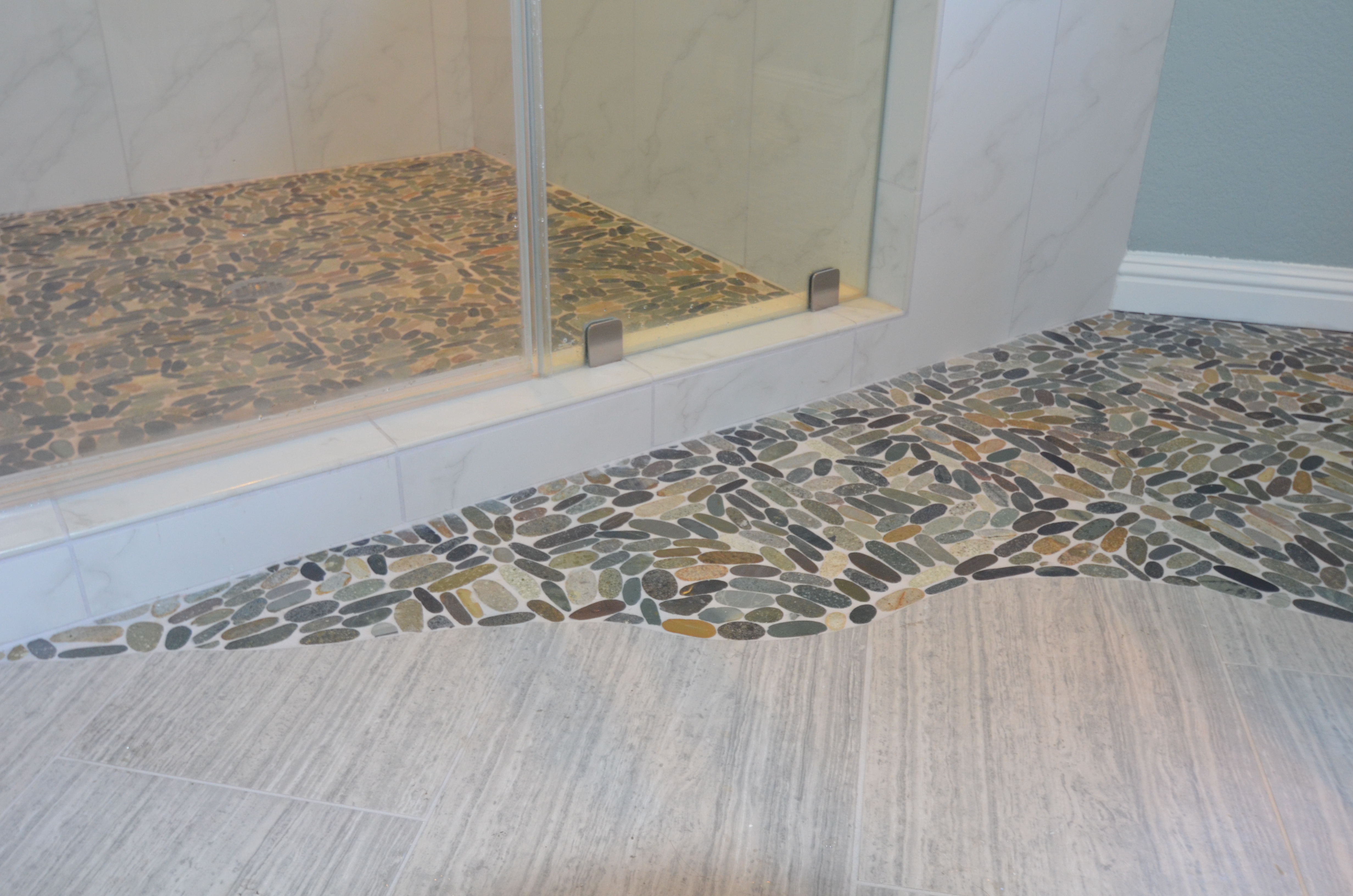
Curbless shower design with pebble tile flooring that creates a natural transition between wet and dry areas while adding texture and slip resistance.
Details That Matter More Than the Tile Choice Itself
We see homeowners agonize over the tile and then overlook the decisions that will have a bigger impact on how it actually looks. Here's what we pay attention to on every install.
| Detail | Bold Tile | Neutral Tile |
|---|---|---|
| Grout color | Match grout to tile — let the tile speak | Contrast grout (warm gray, linen) adds definition without drama |
| Tile finish | Matte or handmade glaze softens bold colors | Glossy reflects light; matte hides smudges near the stove |
| Layout direction | Horizontal emphasizes width; stacked emphasizes height | Herringbone adds movement to an otherwise quiet palette |
| Lighting | Under-cabinet lighting dramatizes texture and color shift | Warm-toned LEDs prevent neutral tile from reading as cold |
| Grout joint width | Wider joints emphasize individual tile character | Tighter joints create a more seamless, contemporary look |
How to Actually Decide
After forty years of helping homeowners through this exact conversation, the questions that cut through the indecision fastest aren't about the tile — they're about how you live.
Lean Bold If…
- Your cabinets and counters are neutral and you want the backsplash to carry the room
- You're staying in the house long-term and want it to feel like you
- You love a specific tile so much you keep coming back to it
- The kitchen has strong natural light that can handle contrast
- You want one feature area (behind the range, a niche) rather than full coverage
Lean Neutral If…
- You're planning to sell within five years — neutrals have the broadest appeal
- Your cabinets or counters already have strong visual weight
- The kitchen is small and you want it to feel open, not busy
- You change your mind about colors often and want flexibility
- You're remodeling a Rossmoor condo with resale in mind
The Move We Recommend Most Often: Both
The all-or-nothing framing is the thing that keeps people stuck. You don't have to choose between a kitchen that's bold and a kitchen that's timeless — because the best kitchens we've built are both.
The approach we return to most often: neutral field tile across the main run of backsplash, with a feature tile behind the range or in a floating shelf niche. The field tile handles practicality and resale appeal. The feature tile handles personality. Neither one competes with the other.
From the Jobsite — Walnut Creek, 2024
The client had been stuck between a patterned Moroccan tile she loved and a clean white subway tile she knew was "smart." We suggested she use both — subway tile across the full backsplash, with a band of the Moroccan tile as a horizontal accent above the range that wrapped into the ventilation hood surround.
She got the drama. She got the practicality. And the Moroccan tile, contained to that one area, read as intentional rather than overwhelming. Six months later she sent us a photo of her kitchen at dinner — warm light, the pattern catching the glow from the pendant above. "I would have gone all subway tile and spent five years wishing I hadn't," she said.
— Candi Toupin
Candi's Take
I grew up watching my dad set tile. The thing I noticed early — even before I understood what I was seeing — was that he never rushed the decision. He'd look at a layout for a long time before he committed. Not because he didn't know what he was doing, but because he understood that once it was set, it was set. Tile is one of the most permanent decisions in a kitchen.
So when a client is stuck, I take that seriously. But I also know that the stuckness usually comes from trying to make the decision in the abstract — on Pinterest, in a showroom, in their head. Get the samples home. Put them on the wall. Cook dinner with them there for three days. The answer almost always shows up on its own.
— Candi Toupin, Toupin Construction
Questions We Hear in the Tile Aisle
How do I know if a bold tile will date my kitchen?
Ask yourself whether the tile's appeal is about the color or the format. Zellige tile has been made in Morocco for centuries — the format is ancient, the appeal is permanent. An emerald green in a very specific trending shade is a different conversation. Tiles that derive from craft traditions and natural materials tend to age better than tiles that are following a specific color moment. When in doubt, look at whether the tile appears in kitchens from 15 years ago that still look good — that's your best predictor.
Does grout color really matter that much?
More than most people expect. Grout color is one of the decisions we see homeowners underestimate most — and regret most. White grout on white tile reads as seamless and clean. Gray grout on white tile defines every individual tile and creates grid lines across the surface. Neither is wrong, but they look dramatically different. On bold tile, matching the grout to the tile usually lets the pattern do the work. On neutral tile, a slightly contrasting grout adds quiet texture. Look at full-size samples with your actual grout color before you commit.
What's the most popular backsplash choice you're installing right now in East Bay kitchens?
The combination we're installing most often: a handmade subway tile in a warm off-white (not bright white) across the main run, with a zellige feature area behind the range — usually in a soft teal, warm white, or dusty sage. It photographs well, it ages well, and it hits the "classic but not boring" note that most of our clients are actually looking for. If you want one combination to start from, that's it.
Should I match my backsplash to my countertops?
Not necessarily — but they need to coexist. The principle is contrast vs. competition: a neutral countertop and a bold backsplash work because they contrast. A busy countertop and a bold backsplash compete, and the room feels restless. If your counters have strong veining or pattern (like many quartz and marble options do), we usually recommend a quieter tile to let the countertop be the statement. Bring countertop samples when you're choosing tile — don't evaluate them separately.
How do I choose a backsplash height — does it go all the way to the ceiling?
It depends on the ceiling height and the visual weight you want. Full-height tile to the ceiling (or to the underside of upper cabinets) makes a bold statement and works beautifully with a tile that can handle scale. Standard height — from counter to the bottom of upper cabinets — is more common and easier to live with. In Rossmoor units especially, where ceiling heights are often 8 feet, full-height can make a small kitchen feel taller. We have a whole post on backsplash heights if you want to go deeper: Backsplash Heights — What Actually Looks Good.
Still stuck on backsplash? Let's look at it together.
Bring your samples, bring your cabinet swatches, bring your indecision — we've helped a lot of homeowners find their tile, and we're happy to help you find yours.
Get a Free Consultation See Our WorkCall us: 925-937-4200 · CA Lic #626819
Toupin Construction
Ready to start your remodel?
Whether you're dreaming of a new kitchen, a spa-worthy bathroom, or a whole-home transformation — we’d love to hear about your project. Reach out and let's talk.
‹ Back
Comments